I've spent most of my life visiting Disney, Busch Gardens, Six Flags, Tivoli Gardens, and more. Somewhere along the way, I fell in love with the parts most guests never think about — the signage, the landmarks, and the invisible design decisions that guide millions of people from entrance to exit without a single moment of confusion.
Then one day, while working my corporate fintech job and squeezing in mentoring sessions on my lunch breaks, I was daydreaming about Disneyland — specifically the mac and cheese balls and the Winnie the Pooh M&M rice crispy treat — while reviewing a junior designer's portfolio. That daydream cracked something open: a UX portfolio works exactly like a theme park.
I can feel the eye roll from here. But stay with me, because this isn't a cute metaphor — it's a 1:1 structural comparison. And once you see it, you can't unsee it.
Most portfolios aren't designed like theme parks. They're designed like state fairs. Booths scattered everywhere. No hierarchy — just everything competing for attention at the same volume. No clear path from one thing to the next. A hiring manager who's already reviewed 40 portfolios today isn't going to "invest" in a state fair when the next tab might be a Disney-level experience with a better return on their time.- Jill Tague, Principal Product Designer
A VP won't champion a hire whose portfolio is a mess for the same reason they won't take their kids to the state fair — it's more work to navigate the chaos than it is to wait for a better option. A better park. A better portfolio.
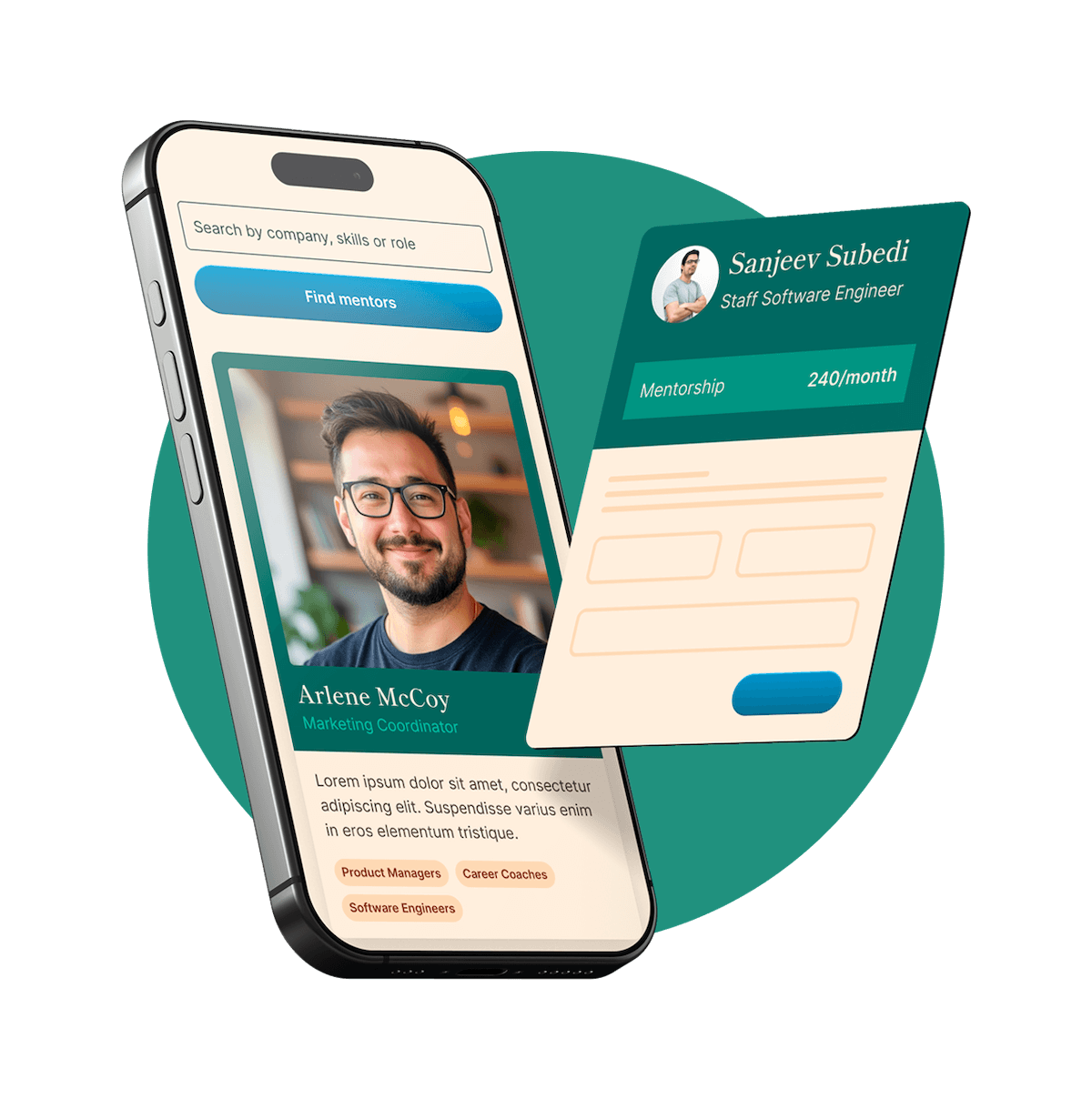
Here are three theme park design principles that fix it.
1. Design Your Entrance Like a Park Gate
Every great theme park has one thing at the entrance: a clear promise of what's inside.
When you walk through the gates at a Disney park, you see the castle. You immediately understand: this is a place of imagination, storytelling, and wonder. That single visual sets your expectations for the next eight hours. Your portfolio homepage needs to do the same thing — in five seconds or less.
What most portfolios do:
- A vague tagline like "I design delightful experiences" (so does everyone)
- A wall of project thumbnails with no hierarchy
- No indication of seniority, specialization, or point of view
What a theme park does — and your portfolio should too:
- Tell them what kind of experience they're walking into. Who you are (role + level), what kind of problems you solve, and a visual signal that says, "this person is intentional about design." All of it, above the fold
- Make a clear promise. Write a one-sentence positioning statement that tells a hiring manager exactly what to expect. Think of it as the sign above the gate. Not clever — clear
"I'm a mid-level product designer who specializes in simplifying complex workflows for enterprise teams."
That's a castle. That's a reason to walk in.
2. Turn Projects Into Journeys, Not Destinations
In a theme park, every attraction has three phases: the queue (context and anticipation), the ride (the
experience), and the exit (what you take away). The best attractions invest in all three. The worst ones dump you in a parking lot— Yep, I’m lookin’ at you Knott’s Berry Farm.
What most portfolios do:
- Jump straight to the final UI with no setup
- Show polished screens with zero context on the problem, the users, or the constraints
- Treat the case study like a highlight reel instead of a story
What a theme park does — and your portfolio should too:
- Build anticipation in the queue (Context). What was the problem? Who were the users? What constraints did you face? What did the business need? This is where you set the stakes and show you understand the why behind the work — just like a queue builds the story before you ever board the ride
- Deliver the ride (Process). What did you actually do? Show your research, your sketches, your iterations, your decision points. This is where a hiring manager sees how you think — not just what you shipped
- Stick the exit (Impact). What happened after launch? Metrics, user feedback, lessons learned. If you don't have hard data, share what you observed or what you'd do differently. A great attraction doesn't dump you in a parking lot — it gives you something to take away. Your case study should do the same
A case study without context is a ride without a queue. It’s disorienting, forgettable, and impossible to evaluate.
3. Build a Clear Path Between Attractions
Here's something most people don't notice about theme parks: you are never lost. Every path leads somewhere. Every turn reveals something new. The layout is designed so that even when you wander, you're still making progress.
But here's the part that's even more impressive — and the part most designers completely miss when building a portfolio.
At Disney, no two lands are the same, AND the transitions between them are seamless.
Walk from Mickey's Toontown into Fantasyland at Disneyland and you won't feel a jarring cut. The Disneyland Railroad runs right overhead, acting as a physical threshold or a signal that you're crossing into something new. Underneath that though, the shift is gentler than most guests realize. The layout of the plants changes. The color palette warms and softens. The music crossfades from playful and cartoonish to something more orchestral and storybook. By the time you're fully in Fantasyland, Toontown has already let go — and you didn't even notice the handoff.
That's not an accident. Disney Imagineers call these transition zones — carefully designed stretches where two completely different worlds blend into each other through shared elements. A structural landmark like the railroad to mark the boundary. A color palette that overlaps. Plants that belong in both worlds. A shift in mood that feels earned, not forced.
What most portfolios do:
- Drop the reader into a completely different project with no bridge from the last one
- Rely on the nav bar to do all the work
- Treat each case study like a standalone island with no connection to the rest
What a theme park does — and your portfolio should too:
- Find your through-line. A transition zone works because of shared elements — a color that appears in both lands, a material that bridges the gap, music that crossfades. What's the common thread across your work? Maybe it's your approach to research. Maybe it's how you simplify complexity. Maybe it's your obsession with onboarding. Name it, and let it show up — even subtly — in every case study. That's your equivalent of the ground texture changing underfoot
- Order your projects strategically. Disney sequences lands so the emotional arc of the day feels intentional, not random. Do the same — lead with your strongest, most relevant work. Place projects that show range in the middle. End with something memorable. The sequence itself tells a story about who you are as a designer
- Curate ruthlessly. A theme park doesn't open every ride at once. It guides you to the headliners and lets you discover the rest. If you have more than 4–5 projects, trim. Pick 3–4 for your main path and tuck the rest into a secondary section
If Disneyland can find a way to go from It's a Small World to Mickey's house, I promise there's a way for you to smooth your project transitions.
The goal: a hiring manager should be able to move through your entire portfolio the way a guest moves through a theme park — from land to land, attraction to attraction — without ever feeling lost, jarred, or wondering, "Where do I go now?"
The Map Check
Before you send your portfolio to another hiring manager, walk through it like a theme park guest:
- [ ] Gate: Can someone understand who you are and what you do in 5 seconds?
- [ ] Queue: Does every case study start with context — the problem, the users, the constraints?
- [ ] Ride: Can a reader follow your thinking, not just see your final screens?
- [ ] Exit: Does every case study end with impact, lessons, or next steps?
- [ ] Path: Is there a clear flow from one project to the next?
- [ ] No dead ends: Can a visitor move through the whole portfolio without getting stuck?
If you check every box, your portfolio isn't just a collection of projects. It's an experience — one that's designed to guide, engage, and land you the interview.
Your portfolio is the one product where you are both the designer and the product. Build the gate. Design the queue. Smooth the transitions. Give every guest a reason to stay — and a clear path to the next attraction.
Jill Tague is a Principal Product Designer and the founder of Design & Travel LLC, where she connects theme park thinking, travel experience, and design practice. She mentors designers on portfolio strategy, career transitions, and building work that speaks for itself.