This morning the song “This Magic Moment” by The Drifters popped into my head for no apparent reason.
Those restless neural networks in our brains do funny things. They make seemingly unrelated, unconnected thoughts and concepts connect.
Slapping my forehead I said to myself: “But, of course…”
Recently I’ve been thinking about those magic moments in UX that happen when we’re interacting with our digital devices or services. We encounter perfect moments, when everything falls into place, in exactly the right way, at exactly the right time, as if it’s magic. It could be at your bank, in your car, a vending machine, or on your phone.
I believe the era of anticipatory design is here, or at least, it’s within our reach.
Our limited graphical user interfaces are transforming as a result of evolving technologies and input methods. It is an organic, natural evolution — we already take talking to our devices for granted!
For example, while driving we might say “dial Anna;” we ask Siri to start a timer or about movies playing nearby; or ask Alexa to play music, and so on. Nonetheless, the metaphors and graphical elements established over four decades ago have not changed that much.
The Past
Consider that Xerox PARC’s original “graphical user interface” is 46 years old yet our UIs still look remarkably like it.
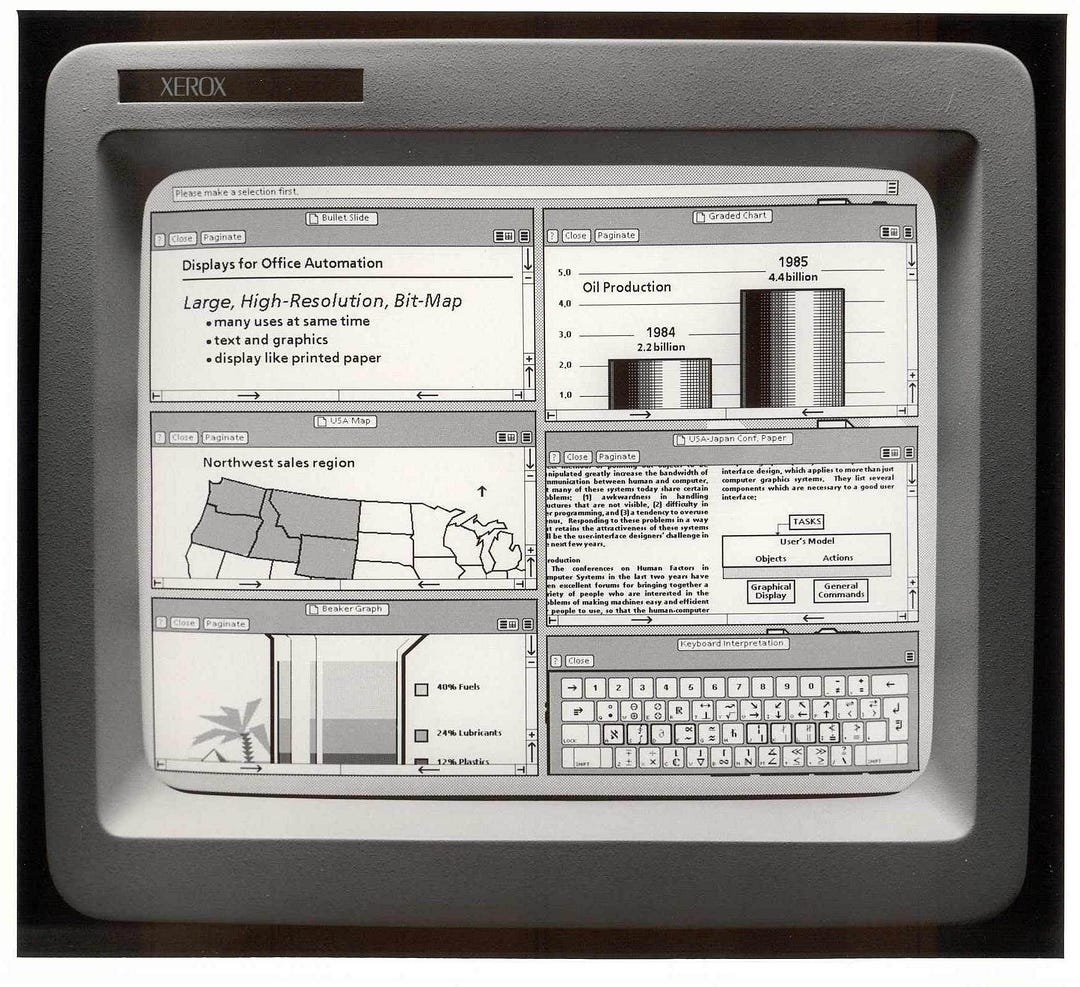 The Xerox Star workstation introduced the first commercial Graphical User Interface (GUI) operating system in 1981
Today, we’re still looking at two-dimensional screens and mostly use keyboards and mice for input; devices designed for interaction methods that were optimized for computers, not humans.
The “machines” we interact with — laptops, desktops, tablets, mobiles, vending machines, etc. — are still designed and built with mental models and technologies that are legacy systems from the past.
It’s as if we’re using interaction models from the Flintstones’ era in a Jetsons’ world; they still rely on a lot of interaction from users (input) to move to the next step and display useful information (output).

What is anticipatory design?
The application of anticipatory design is more important than ever if digital businesses are to simplify and facilitate the course of our digital lives.
In light of this, what is anticipatory design?
It’s output, without much need for input.
A world where our computing machines are designed for interaction methods optimized for humans, not computers. A digital world where we move from user intent that’s deterministic to probabilistic.
Huge’s Aaron Shapiro defines anticipatory design as a method of simplifying processes by responding to needs one step ahead of the user’s decisions, i.e. responding to user needs they haven’t expressed yet.
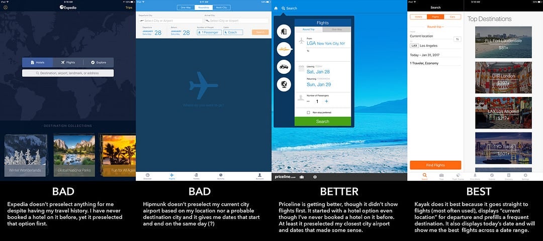 iOS travel apps
Anticipatory design in its finest form goes way beyond personalization.
For example, Netflix showing you movies to watch based on your taste preferences and history is personalization. With anticipatory design, the interface actually changes in the moment as you’re interacting with an app.
 An example of personalization-not anticipatory design.
Anticipatory design would mean — in the case of online shopping for example — that the system would know and personalize an experience to the degree that it would feel like a magic hand guiding your experience. It would actually change the UI on the fly, eliminate any extraneous information, and only present the most relevant options in a timely, simple, and efficient manner.
This is not too difficult to accomplish today.
Let’s say someone is shopping for a very expensive guitar on guitarcenter.com. At the checkout, the site would automagically present “Ship to store for pick-up” as a default choice because it knows by observing the past behavior of other users, buying expensive guitars, that they would prefer to pick it up at the nearest brick-and-mortar store.
For another example, let’s pretend you’re shopping for a shirt on Amazon.
Amazon already personalizes a whole host of things for you and ought to know your size and color preferences since you have purchased shirts on the site before.
When going to the product detail page, it could pre-select your size, and show you navy, white and checkered shirts first, de-emphasize pink and yellow ones, and not force you to select your size every single time.
Why?
Anticipatory design’s promise is the elimination of friction and an increase in efficiency that would greatly improve user experiences, and in turn, impact the bottom line. People return to products and services that deliver what they want when they want it.
Our daily interactions with digital systems have reached an unprecedented scale. Yet many of these interactions are stifled with friction and subsequent feelings of frustration.

There is a real need for customization and personalization on a grander scale that would delight users, and simplify their lives.
Take self-serve transportation ticketing machines, where commuters can refill commuter cards.
They’re still designed to be dumb — driven by user input in which everyone is taken through the same frustrating plethora of options.
One could easily imagine a much improved, more personalized system, where refill history could be stored on your card.
Instead of countless requests for input: select this option first, then select this other option, and so on, the entire interaction could start with you inserting the card you always refill and the system would immediately display, “Hello, would you like to refill this card with $20, using your Mastercard?”
The next step would be to pay and go.
It would cut down the time needed to refill cards by at least 75 percent, increase efficiency, move people along faster, and subsequently make them more satisfied.
This is already possible, yet I don’t know of a single ticketing machine that does this.
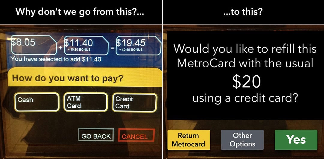 A “dumb” user interface that requires a lot of input vs. one that’s “anticipatory”?
Interfaces of the future
When AI becomes more pervasive, a higher degree of personalization will enable a higher level of anticipatory design.
Based on all kinds of user authorized behavioral tracking — purchase histories, preferences, etc., the system would recognize you, and with a high degree of certainty predict what your next choice might be.
The lack of anticipatory design is surprising given that technologies exist today that would make doing so not that challenging.
Some companies are already practicing early forms of anticipatory design. Two examples are Google Now and Uber.
Google Now
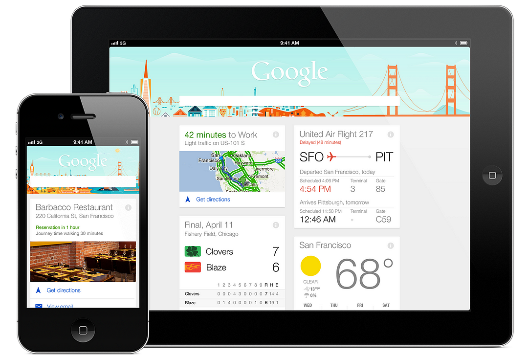
The Google Now app is one of the more ambitious evolutions of Google’s search software. The idea is simple — predict what you’ll want or need to know before you know you need or want it, and serve it up in an easy-to-read card-based format.
Google’s data mining capabilities are second to none. It knows who you are, and it can display cards with personalized, location-aware information, such as calendar events, local weather, news, stock prices, flights, boarding passes, hotels, photo spots nearby, and more. It also tells you how long it will take you to get home from work, based on current traffic conditions.
If Google doesn’t think you need something at the moment, it won’t be displayed. It’s the embodiment of anticipatory design.
Uber
In the Uber app, when you take a trip somewhere it will provide a return button on a subsequent launch of the app because there is a 90 percent chance you would want to return to your original destination. No need to specify pickup and drop-off locations. Brilliant.
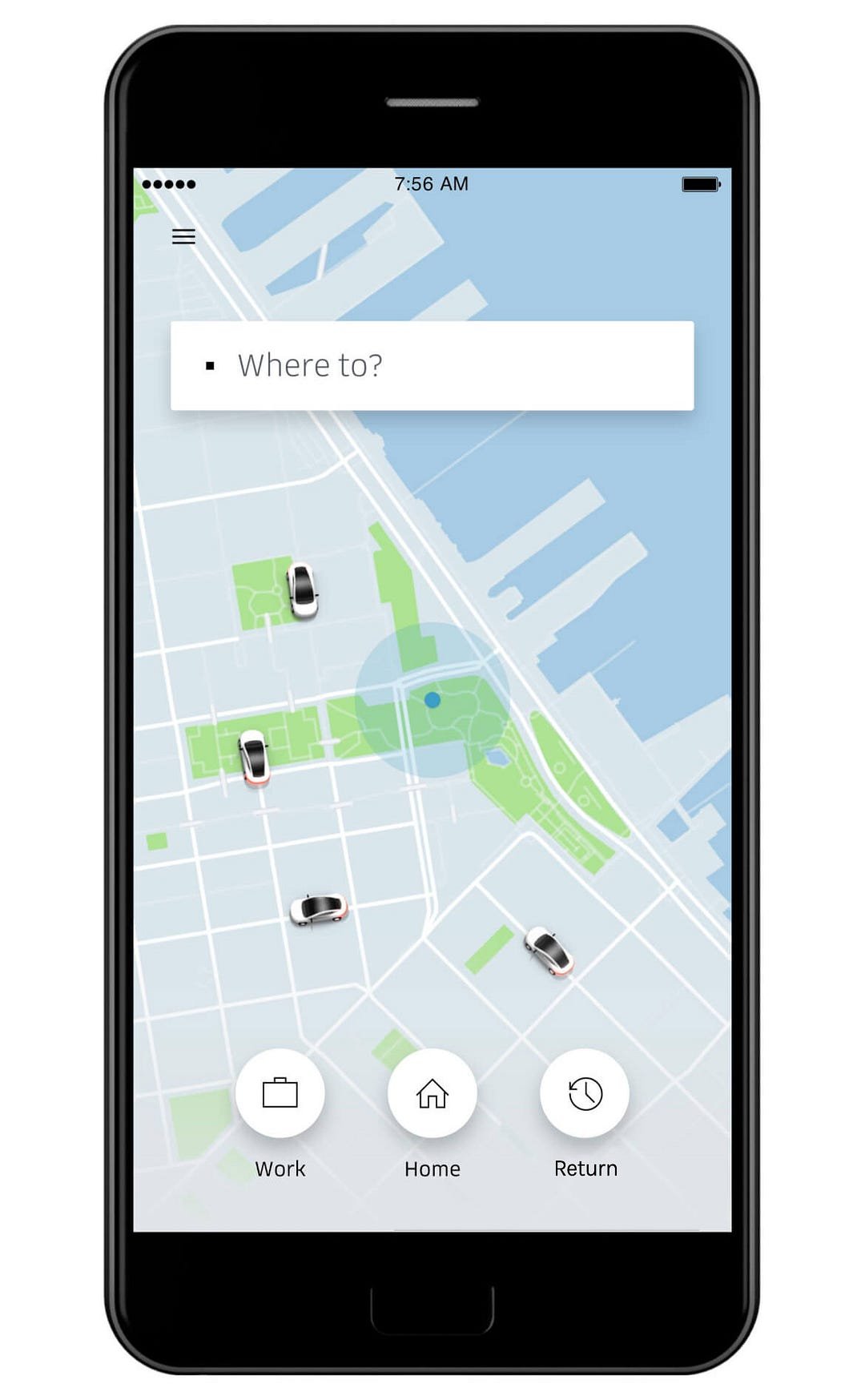 The Uber app gives users a quick shortcut to “Return” when it’s launched shortly after completing a trip
The times they are a-changin’.
Things are evolving to natural interaction methods.
In a not too distant future, our input will be more effortless.
We’ll have augmented and virtual reality with interaction methods, such as voice, gesture tracking, eye tracking, and speech. Google is already working on it. It’s called Project Soli.
Anticipatory design methods, assisted by AI and machine learning, will deliver experiences on an entirely better level.

How do we bring anticipatory design into play?
There is no magic wand, uttering “abracadabra,” so how do we design for those magic moments now? What are the steps we can take today to deliver those magic moments, using anticipatory design?
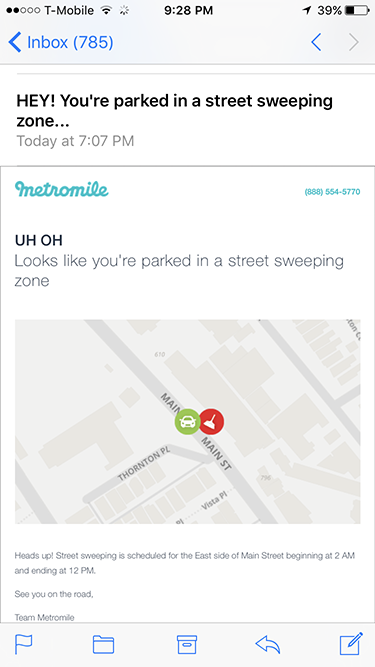 Sophisticated, personalized algorithms at work on Metromile create a sense of being anticipatory and incredibly useful to customers (prevent parking tickets)
Until we have incredibly sophisticated predictive algorithms, fully developed AI, and machine learning, businesses can mine existing data for personalization opportunities thereby reducing potential pain points and barriers.
They can also fully engage the user-centered design process, employ deep research, extensive user-testing, and use tools, like an open-source software library, for machine intelligence, such as Tensorflow.
Deep research will tell us a lot — contextual observation perhaps or ethnographic studies — where we could observe what users are inclined to do from moment to moment in their flow. We could map these user journeys step-by-step, and design the interaction accordingly.
The ideal outcome of applying such data mining and personalization, coupled with user-centered design methods, would create fluid and seamless anticipatory experiences that would please customers and generate loyalty by having things appear as if by magic.
It would advance the state of the art of user experience and create a win-win situation for both businesses and users, offering deeper customer satisfaction that positively impacts the bottom line.
• • •
Here’s a really interesting 19 min video on anticipatory design from the CEO of Huge, Aaron Shapiro: https://vimeo.com/144159815
• • •
I hope you found this an interesting read. Follow me on Twitter


