When welcoming new users, it's important to remember that the onboarding experience can be an emotional rollercoaster. The process should be carefully crafted to amplify positive interactions and mitigate any negative ones to ensure a seamless transition for the user.
Based on this concept, the insights I've gathered have been divided into two key areas: 'Benefits', which highlight elements that should be emphasized and expanded upon, and 'Barriers', which focus on aspects that need to be minimized or eliminated to optimize the onboarding journey.
Benefits
Immediate impact
- Look deep into your business and find what genuine value it can provide instantly.
- Any analogy would be how you choose on Youtube we default to recommended videos over videos in our “watch later”. We prefer that immediately gratification.
- The critical part is to then remind them of immediate benefits at certain points in the flow where they are about to do something hard, i.e giving you their social security number. You don't want them to think, "Is this even worth it?" when they get to this page.
- With Yotta, for example I know that long term its a savings account but at 9pm tonight I have the chance to win $1,000,000 so I’m keen on trying that out. (See image below)
- Some more inspiration:"Link a bank, get an instant limit up to $500.","Finish KYC to spend your $10 credit with your new virtual card.","Link a bank, and we'll be able to give you 5 instant suggestions on where to cut down spending.""Invest today and see a return in days, not years" - You know your app better than I do, but you get the point ;)
- "Link a bank, get an instant limit up to $500."
- "Finish KYC to spend your $10 credit with your new virtual card."
- "Link a bank, and we'll be able to give you 5 instant suggestions on where to cut down spending."
- "Invest today and see a return in days, not years" - You know your app better than I do, but you get the point ;)

Social proof
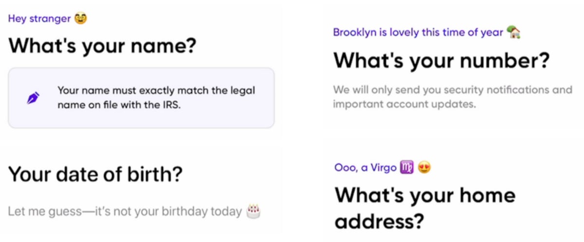
Humans, especially when faced with uncertainty or unfamiliar situations, tend to rely on social proof—the idea that others' actions signal the correct behavior. This principle can be strategically employed in scenarios where trust and compliance are paramount, such as when requesting sensitive personal information like social security numbers or banking details.
Reminding individuals of the context and importance of such requests before they are asked to provide the information can significantly increase their willingness to comply. This reminder serves as a form of social reassurance, subtly implying that sharing this information is a normal and expected step in the process.
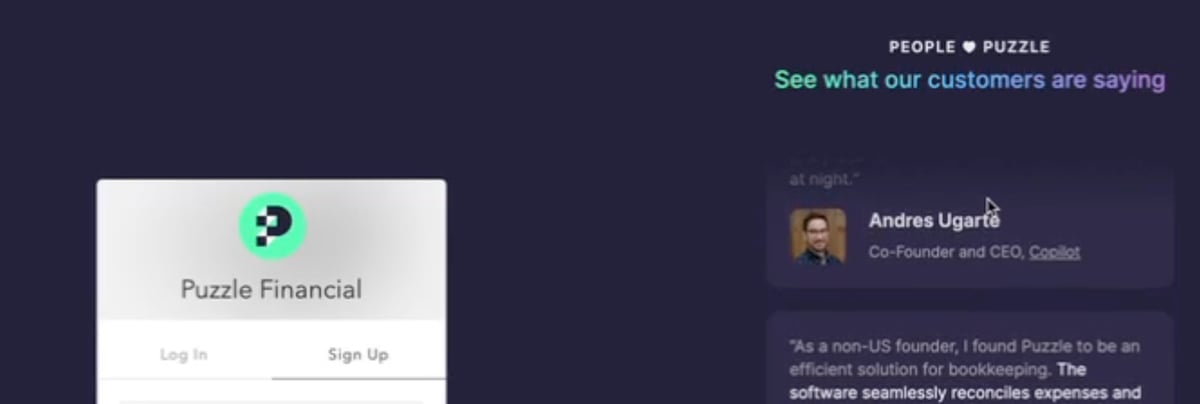
Puzzle does a great job at this (see above) but they also take it one step further. Not only including testimonials in the sign up process, but pick the ones written by founders well respected in our industry. Robert Cialdini tells us in Influence that we comply with symbols of authority.
The Halo Effect
According to Cialdini and maybe intuition, we comply with people we like. So if you are complimenting the user or seem approachable with your copy, the user is more likely to comply. Both Bloom and Yotta nail this. See below.
Endowment effect
Users will overvalue what they own, regardless of market value. Here is how you can use this early in onboarding.
This taps into a bias called Loss aversion whereby your users prefer to avoid losses more than gaining something:
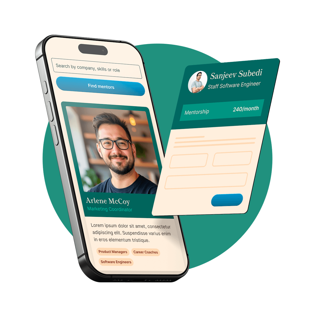
- Building the user profile so they can feel like their account is personalized:You can see Bloom’s example of this below with building your profile with stocks to follow to get price alerts.
- You can see Bloom’s example of this below with building your profile with stocks to follow to get price alerts.

Barriers
Now you want to minimize the downs:
Reduce bank linking complexity
- Linking bank accounts often causes significant drop-off in onboarding, making it crucial to execute this step effectively.
- Teller has, in our opinion, the best UX for bank linking for the top US 20 banks, as well as the best reliability.
- Here is an example of someone linking Wells Fargo on Teller vs linking to Wells Fargo elsewhere. Literally 5 pages saved…
- Unifying multiple aggregators is key for a complete experience as Teller supports only the top 20 banks if you want to increase conversion to connected bank accounts. This is something Brex, Ramp & others have already realized.
Reduce cognitive load
This is low hanging fruit that is sure to improve conversions. I would start here first:
- Break up steps. So if you have multiple steps per page, break them into 2 pages. In the users' mind, it’ll feel faster.
- Remove unnecessary taps, e.g., pasting phone number for OTP from messages should auto-continue to the next page.
- Auto-fill address from search. No one wants to be typing that.
- Reduce text. Your users don't want to read. Anything you can explain in a single line is better.
- Progressive disclosure - you might think showing users all of your features so one thing might catch their eye. However, this is not the case. Don't hedge bets; getting them to mile 1 requires focus, so don't distract them.
Simplify by removing unnecessary pages
Here are some examples of pages you can remove or modify.
- Shipping address pagePopulate the shipping address with the same address you got from them during KYC, then just ask them to confirm.
- Populate the shipping address with the same address you got from them during KYC, then just ask them to confirm.
Visibility of system status
Users don't want to feel lost or not know when the end is in sight. You can solve this in 2 main places.
- Add steps to your onboarding flow so users know where they are in your flow and how close they are to the end.
- Once they are on the home tab, make sure they know exactly what to do next, and it's clear that it is the next step. Here is an example from Yotta.
If you are working on improving your onboarding right now and need help improving conversions book a time with me