Color has a profound impact on our emotions, behavior, and perception of the world around us. It is an essential aspect of visual communication and a powerful tool for designers to convey meaning and evoke specific responses from their audience. This is why color theory has become a crucial component of design, informing the choices of color combinations and hues to be used in various design projects. In this article, we'll delve into the fundamentals of color theory and explore its applications in design.
The study of the color theory involves the understanding of how colors interact with each other and the impact they have on our emotions and behavior. The psychology of color is a complex and fascinating field, with different colors having the ability to evoke different emotions and responses from an audience. For example, red is often associated with energy, excitement, and passion, while blue is associated with calmness, trust, and stability.
In design, the use of color is a crucial aspect of visual communication, allowing designers to convey meaning and evoke specific responses from their audience. This is why color theory is an essential component of design, providing guidelines and principles for the use of color in various design projects.
The Color Wheel
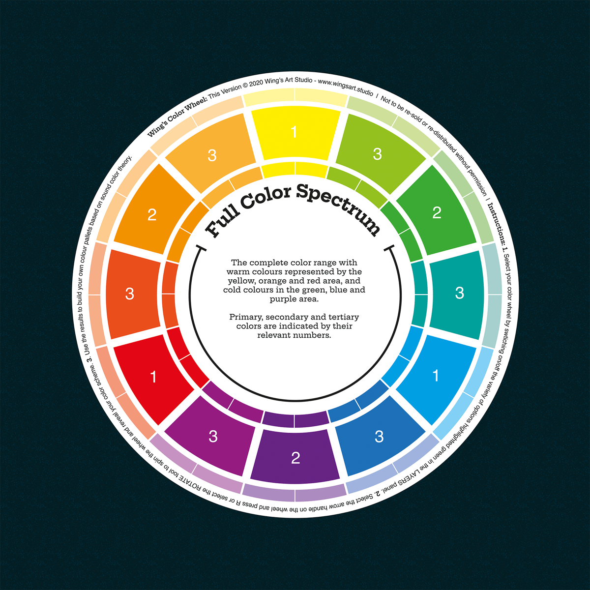
The color wheel is an essential tool for designers as it provides a visual representation of the relationships between colors. It is a circular arrangement of colors that helps designers understand how colors can be combined to create harmonious color schemes. The color wheel is usually made up of three primary colors (red, yellow, and blue), three secondary colors (green, orange, and purple), and six tertiary colors (yellow-green, blue-green, blue-purple, red-purple, red-orange, and yellow-orange).
The primary colors, red, yellow, and blue, cannot be created by mixing other colors. These colors are considered the building blocks of all other colors, as all other colors can be created by mixing two or more of these primary colors. Secondary colors, on the other hand, are created by mixing two primary colors.
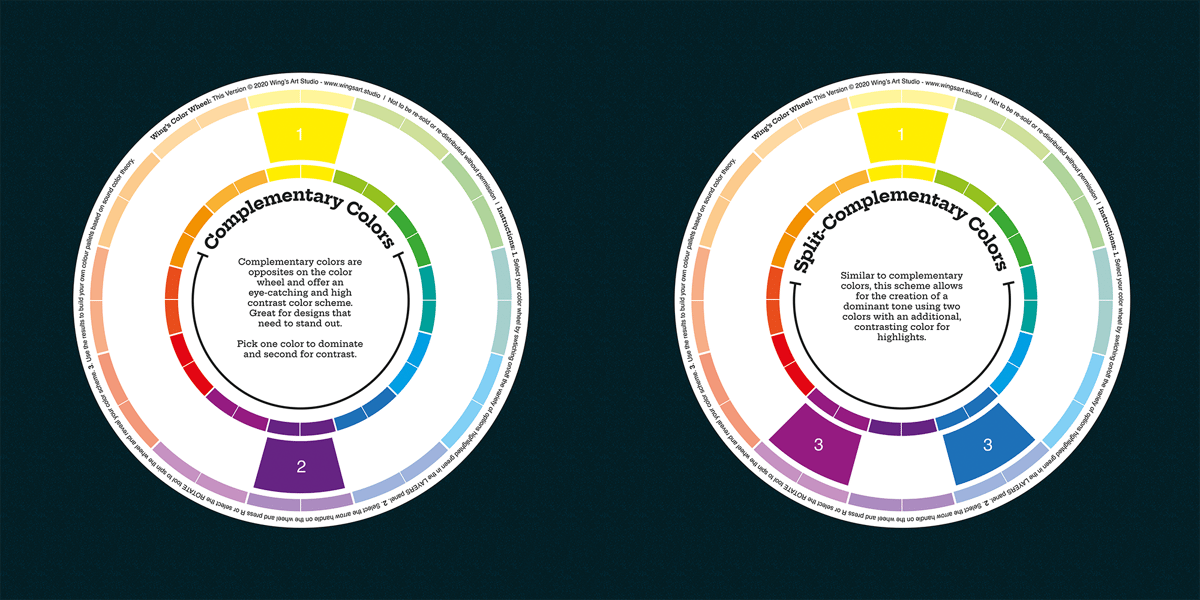
One of the most useful applications of the color wheel is its ability to show the relationships between colors and how they can be used to create harmonious color schemes. For example, complementary colors are colors that are opposite each other on the color wheel and provide a high level of contrast when used together. Analogous colors are colors that are adjacent to each other on the color wheel and provide a harmonious and cohesive look when used together.
Tertiary colors, which are created by mixing a primary and a secondary color, provide a range of options for designers to choose from. Tertiary colors can be used to add depth and interest to a design, as they offer a more nuanced and varied color palette compared to primary and secondary colors.
In conclusion, the color wheel is a valuable reference tool for designers, as it provides a visual representation of the relationships between colors and how they can be combined to create harmonious color schemes. Understanding the color wheel is an essential aspect of color theory and can greatly enhance the effectiveness of color use in design projects.
Color Harmonies
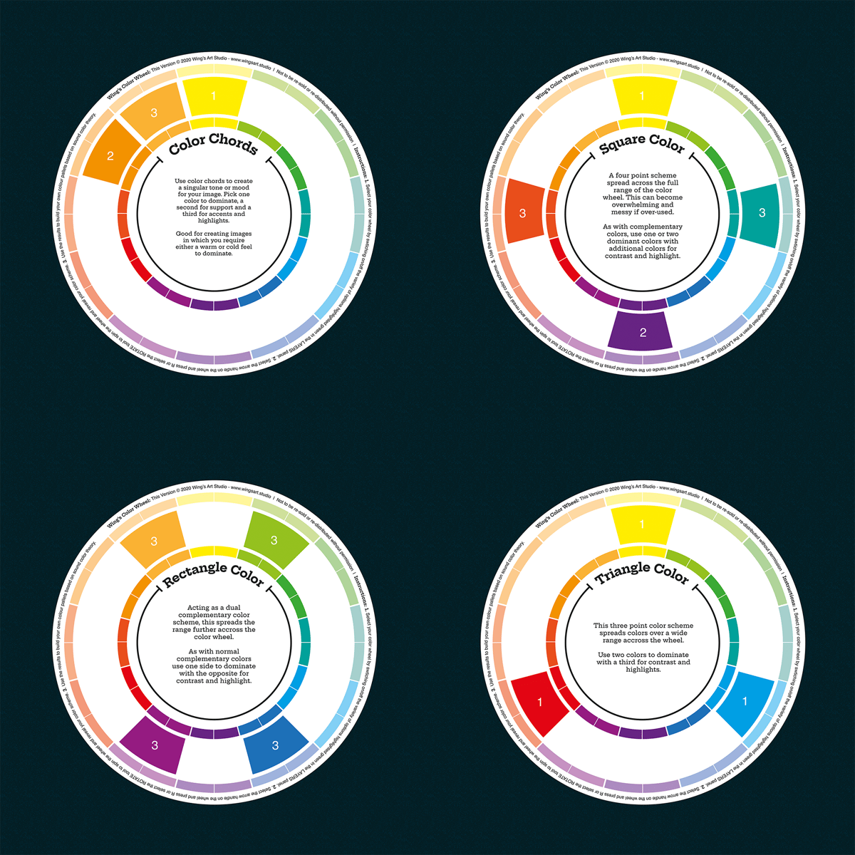
Color harmonies are combinations of colors that are pleasing to the eye and create a sense of visual balance. There are several types of color harmonies, including complementary, analogous, and triadic.
Complementary color harmonies consist of two colors that are opposite each other on the color wheel. These color combinations are high in contrast and create a vibrant, attention-grabbing effect.
Analogous color harmonies consist of three colors that are next to each other on the color wheel. These color combinations are typically more harmonious and create a soothing, cohesive effect.
Triadic color harmonies consist of three colors that are evenly spaced around the color wheel. These color combinations provide high visual contrast while still maintaining a sense of balance.
The Importance of Color in Design
Color plays a vital role in the design, serving as a means of visual communication and helping to establish a brand's identity. It can evoke emotions, influence behavior, and even affect our perception of time. For example, warm colors such as red and yellow tend to evoke feelings of energy and excitement, while cool colors such as blue and green are associated with calmness and serenity.
In branding, color can help to differentiate a company from its competitors and create a unique visual identity. For example, the use of the color blue is often associated with trust and security, making it a popular choice for companies in the finance and insurance industries.
Designers also use color to create visual interest and guide the viewer's eye to specific elements of a design. For example, by using a bright accent color, a designer can draw attention to a particular call-to-action or header.
Color in Web Design
The use of color in web design is just as important as in any other form of design. It can help to create an aesthetically pleasing experience for users, while also serving to convey the message and overall brand identity of a website.
In web design, color can be used to create a visual hierarchy, with the use of contrasting colors to indicate different levels of importance. For example, a brighter color can be used for headings, while a softer color can be used for body text.
Additionally, color can be used to create a sense of depth and dimension on a flat screen. By using a gradient, designers can create the illusion of light and shadow, making elements on a page appear to pop.
Conclusion
Color theory is a fundamental aspect of design that can have a significant impact on the success of a project. By understanding the relationships between colors and how they can be combined to
create harmonious color schemes, designers can effectively communicate their intended message and evoke specific responses from their audience. Through the use of the color wheel and various color schemes, designers can choose the right colors to convey the desired mood, tone, and meaning of their design projects.
In addition, color theory also considers the cultural and historical context of color usage, as well as the physiological effects of color on the human eye and brain. This allows designers to not only choose colors that aesthetically complement each other but also to make informed decisions about color choices that are culturally sensitive and appropriate for their target audience.
In conclusion, color theory is a crucial component of design that provides a comprehensive understanding of color usage and its impact on visual communication. By incorporating the principles of color theory into their work, designers can elevate their projects to the next level and achieve their desired results.
Here is one of my videos where I explain how to use colors to Speed up your Workflow:
https://youtu.be/jRnJQb2sv8s