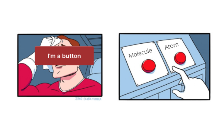
Most designers in this day and age have heard of Brad Frost’s “Atomic Design” - It’s a really great methodology for visualising how components in an interface interact with each other. As design systems have matured and gotten a lot more complex, I’ve found this method begins to fall over especially when working at an enterprise level.
The biggest reason why this fails at this level of complexity is the ambiguity of the naming conventions in Atomic design, and how these correlate to things in real life. Atomic uses a 5 levelled structure that is built on top of each other to create hierarchy.
The first 3 is where i’ve seen the ambiguity happen the most. The structure of these is:
- Atoms - The basic building blocks of a design system. They represent the smallest, indivisible components like buttons, text styles, icons, etc.
- Molecules - are groups of atoms working together as a functional unit, like a search form with a text field and button
- Organisms - are more complex structures made up of molecules and atoms, such as a header with navigation, search, and logo
There’s also 2 more, which are focused on structure and layout.
- Templates - are essentially wireframes that define the overall content structure and layout of a page, without using any final styles or content.
- Pages - a combination of templates to form a defined information architecture.
The biggest problem with using this methodology is the lack of consistent understanding amongst stakeholders in a design system about this process. As design system elements get more complex, they become increasingly harder to categorise.
Take a button for example, the theory says this should sit in atoms, and the description says, “foundational building blocks that comprise all our user interfaces”. Sure, a button might be as basic as you can get in terms of HTML, but we’re talking about design systems here. Atoms should really classify things such as hex codes, spacings and icons which buttons would then inherit and be built upon. This further adds to the misunderstanding of how these element are actually used in practice.

As we go further up the chain with organisms, what specifically defines which elements go where? The example the theory gives is a search bar, comprised of an input and button joined together. But how complex do we get with this and at what point does this become a template?
An alternative, simpler naming convention for these elements is:
Styles - are the fundamental elements of a design system. They cannot be broken down any further. Examples include typography, spacing, colours and icons
Components - are combinations of two or more styles that work together to perform a specific task. Components are fixed and rigid. They have properties and cannot be modified without updating the design system. Examples include, buttons, input fields, checkboxes and selects.
Patterns - are best practice layouts and interactions for specific user tasks that use components as their building blocks. Patterns flex with the requirements for each product and are not fixed. Examples include forms and address layouts
Components are fixed in their appearance and layout, with limited customisation, providing a rigid framework. They’re also still atomically linked to styles. They’re a combination molecules and organisms but with reduced ambiguity. Components also much better reflect how things are named and built in real life - for example reusable elements in Figma are called components as they are in code (eg. Web Components). The only caveat that i’ve found with this convention is with engineers specifically getting confused with design system components (that don’t contain business logic) and framework specific components (React, Angular, Vue etc.)
In contrast, patterns are flexible, acting more as guidelines for common layouts. Patterns are able to change, with components added and removed based on the requirements of the product or experience. Patterns might be considered as the last 2 elements of atomic theory - templates and pages. Think about components and patterns as Lego. Components are the bricks themselves, and patterns are the instructions to put them together. All of these things should be encompassed by comprehensive documentation to ensure everything is implemented correctly and accessibly.
It can become an workflow nightmare when elements of a design system aren't organised properly. It adds to confusion and can ultimately end up in shipping inconsistent products. As systems get more and more complex with tens or hundreds of elements to maintain, it gets even more complicated. Across the industry, design systems are built on this ambiguity and it's almost certainly taking hundreds of hours of meetings, slack messages and conversations to unpick what fits where, slowing down delivery and introducing unnecessary tech and design debt.
Need help setting proper foundations in your design system? Reach out for a chat!
Reference: Brad Frost's Atomic Design


