Master your next Graphic Design interview with our comprehensive collection of questions and expert-crafted answers. Get prepared with real scenarios that top companies ask.
Master Graphic Design interviews with expert guidance
Prepare for your Graphic Design interview with proven strategies, practice questions, and personalized feedback from industry experts who've been in your shoes.
Choose your preferred way to study these interview questions
Can you walk me through your portfolio and explain the design problem, your process, and the outcome for three projects you’re most proud of?
Can you walk me through your portfolio and explain the design problem, your process, and the outcome for three projects you’re most proud of?
I’d pick three projects that show range: branding, product design, and campaign work. I’d frame each one as problem, process, outcome, so the interviewer sees how I think, not just what I made.
Brand identity for a wellness startup: They looked generic and struggled to stand out. I led discovery, audience research, moodboards, and built a flexible visual system with type, color, and packaging. Outcome: stronger shelf presence, consistent assets, and a brand they could scale confidently.
Mobile app redesign for a nonprofit: Donations were dropping because the flow felt confusing. I audited the UX, mapped pain points, wireframed cleaner journeys, then tested and refined UI. Outcome: smoother onboarding, higher conversion, and better accessibility.
Social campaign for a fashion launch: They needed attention fast across multiple channels. I created a modular campaign system, motion assets, and templates for quick rollout. Outcome: cohesive visuals, faster production, and strong engagement.
What do you check before sending a file to print?
What do you check before sending a file to print?
Before print, I run a quick preflight to avoid expensive surprises.
Document size, bleed, and safe margins are set correctly.
Color mode is CMYK or the required spot colors, not RGB.
Images are high enough resolution, usually 300 dpi at final size.
Fonts are embedded, packaged, or outlined if needed.
Black text is 100K, and rich black is only used where appropriate.
Linked images are updated, nothing is missing, and layers are clean.
Export settings match the printer spec, usually PDF/X with crop marks if requested.
I also proofread one last time and, if possible, print a hard copy or zoom in for a final visual check.
How do you translate a brand’s personality into visual elements like typography, color, imagery, and layout?
How do you translate a brand’s personality into visual elements like typography, color, imagery, and layout?
I start by turning the brand strategy into a few clear attributes, like bold, premium, playful, or grounded. Those words become the filter for every design choice, so the visuals are not just attractive, they feel consistent with the brand’s voice.
Typography sets tone first, a geometric sans can feel modern and confident, while a serif can feel editorial or premium.
Color builds emotion, bright high-contrast palettes feel energetic, muted tones feel calm or refined.
Imagery should match the brand’s world, candid photography feels human, polished studio shots feel elevated.
Layout controls personality too, lots of white space can feel luxurious, dense modular grids can feel efficient and tech-forward.
I usually create a small visual system, then test it across touchpoints to make sure the personality stays consistent in real use.
Can you describe your process for developing a visual identity from concept to final delivery?
Can you describe your process for developing a visual identity from concept to final delivery?
My process is structured, but flexible enough to adapt to the brand and team.
I start with discovery, understanding the business, audience, competitors, goals, and brand personality.
Then I translate that into strategy, defining key attributes, tone, positioning, and visual territory.
Next comes exploration, moodboards, typography, color, symbols, and a few distinct creative directions.
I refine one direction based on feedback, building out the logo system, supporting graphics, and real-world mockups.
After approval, I create guidelines covering usage, color, type, spacing, and applications.
Final delivery includes organized files, export packages, and a handoff that makes implementation easy for internal teams or developers.
I try to balance creativity with clarity, so the identity looks strong and also works in practice across print, digital, and social.
How do you approach a new design brief when the client or stakeholder gives you very little direction?
How do you approach a new design brief when the client or stakeholder gives you very little direction?
I treat a vague brief like a discovery problem first, not a design problem. The goal is to create clarity quickly so I do not waste time designing in the wrong direction.
I start by asking focused questions, business goal, audience, success metric, constraints, and timeline.
I look for existing clues, brand assets, past campaigns, competitor references, and anything they like or dislike.
I turn that into a simple creative brief, even one page, so we align before I design.
If they still are not sure, I present 2 or 3 distinct directions with different moods or strategies.
I explain the thinking behind each route, so feedback is about goals, not just personal taste.
For example, with a startup landing page, the founder just said, "make it feel premium." I clarified the audience, built three visual territories, and we picked one in one review instead of drifting for weeks.
What steps do you take to research a brand, audience, and competitors before starting a design project?
What steps do you take to research a brand, audience, and competitors before starting a design project?
I usually frame it in three buckets, brand, audience, and market, then turn that into clear design criteria.
Brand: review the mission, values, voice, visual history, current assets, and any brand guidelines.
Audience: look at demographics, behaviors, pain points, motivations, and where they interact with the brand.
Competitors: audit direct and indirect competitors, note visual patterns, messaging, positioning, and gaps to own.
Internal input: talk to stakeholders, sales, or customer support, because they know what customers actually respond to.
Output: create a moodboard, keyword list, and a few strategic rules so every design choice ties back to research.
In an interview, I would add a quick example, like researching a wellness brand and finding the audience wanted calm, credible visuals, while competitors all looked overly clinical, which opened space for a warmer direction.
What principles do you rely on most when designing for clarity and readability?
What principles do you rely on most when designing for clarity and readability?
I lean on a few core principles every time: hierarchy, simplicity, consistency, and spacing. If people have to work to understand the layout, the design is not doing its job.
Clear visual hierarchy, so the eye knows what to read first, second, and third.
Strong contrast, especially in type size, weight, and color, to improve legibility.
Generous white space, because crowded layouts feel harder to scan.
Limited type choices, usually one or two fonts, to keep things cohesive.
Consistent alignment and grid use, so everything feels organized and intentional.
Plain, direct messaging, because clarity is not just visual, it is verbal too.
I also check designs in real-world conditions, like on mobile, at small sizes, or viewed quickly, because readability has to hold up in context.
How do you balance creativity with brand guidelines that may feel restrictive?
How do you balance creativity with brand guidelines that may feel restrictive?
I treat brand guidelines as creative constraints, not limitations. They give me the boundaries, tone, color, typography, imagery style, and within that space I look for fresh ways to make the work feel distinctive and effective.
First, I identify what is fixed versus flexible, logo use may be fixed, but layout, pacing, illustration style, or photo cropping often have room.
Then I focus on the problem to solve, audience, message, and platform, because strong concepts can still thrive inside a system.
I usually explore a few directions that all stay on-brand, but push different aspects of the identity.
If something feels too restrictive, I test whether breaking a rule serves a real goal, and I bring a clear rationale.
In practice, this helped me refresh a campaign by keeping the core palette and type system, while introducing bolder compositions that improved engagement.
How do you handle feedback that is vague, conflicting, or based on personal preference rather than design goals?
How do you handle feedback that is vague, conflicting, or based on personal preference rather than design goals?
I handle it by separating opinion from objective design feedback, then guiding the conversation back to the brief, user needs, and business goals.
If feedback is vague, I ask targeted questions like, “What feels off, clarity, hierarchy, tone, or usability?”
If it’s conflicting, I map each comment to the stakeholder’s priority and look for the shared goal underneath.
If it’s personal preference, I stay open but ask how that preference supports the audience or project objective.
I like offering 2 focused options, then explaining the reasoning behind each one.
When needed, I use the brief, brand guidelines, or user data as a neutral tie-breaker.
In practice, I’ve had stakeholders disagree on homepage visuals. I reframed the discussion around conversion and clarity, presented two routes, and we aligned quickly because the decision was tied to outcomes, not taste.
Describe a situation where you had to defend a design decision to a non-designer stakeholder.
Describe a situation where you had to defend a design decision to a non-designer stakeholder.
I’d answer this with a quick STAR structure, situation, tension, action, result, then keep the focus on how you translated design into business value.
At my last job, a sales director wanted a landing page packed with text, badges, and three CTAs because he felt “more info sells more.” I explained that the page’s job was clarity, not completeness, and showed him heatmap data plus two competitor examples where cleaner hierarchy improved conversion. Instead of arguing aesthetics, I framed it around user behavior and lead quality. We compromised by keeping the strongest proof points above the fold and moving the rest lower on the page. After launch, conversion went up 18 percent, and he became much more open to testing design decisions instead of debating opinions.
How do you decide when to use custom illustration, photography, iconography, or stock assets in a design?
How do you decide when to use custom illustration, photography, iconography, or stock assets in a design?
I decide it by starting with the message, the audience, and the level of uniqueness the brand needs. Then I match the visual approach to the job instead of forcing one style everywhere.
Custom illustration, when I need a distinct brand voice, abstract ideas, or something playful and ownable.
Photography, when authenticity, emotion, product realism, or human connection matters most.
Iconography, when information needs to be scanned fast, like in dashboards, wayfinding, or feature lists.
Stock assets, when budget or timeline is tight, but only if they feel credible and can be art directed into the system.
In practice, I also look at scalability, licensing, accessibility, and consistency across touchpoints.
Usually the best solution is a mix, like branded illustrations with real photography and a clean icon set to hold everything together.
How do you manage multiple design projects with competing deadlines?
How do you manage multiple design projects with competing deadlines?
I manage it with a mix of prioritization, visibility, and realistic time planning. The goal is to keep quality high without letting urgent work constantly derail everything else.
I start by ranking projects by deadline, business impact, and dependency, not just who asked first.
I break each project into phases, like research, concepts, revisions, and final production, so I can estimate time more accurately.
I use a simple tracker, usually Asana or Notion, to see what is due this week, what is blocked, and what needs feedback.
I build in buffer time, because revisions and stakeholder delays always happen.
If deadlines truly conflict, I communicate early, align on priorities, and negotiate scope, timeline, or support.
In practice, if two campaigns land at once, I lock the higher-impact one first, then narrow deliverables on the second so both stay on track.
How do you optimize designs for digital use across different screen sizes and platforms?
How do you optimize designs for digital use across different screen sizes and platforms?
I optimize for systems first, then refine for context. The goal is consistency without making everything feel rigid.
Start with responsive layouts, grids, spacing rules, and scalable type.
Design mobile-first, then expand for tablet and desktop based on content priority.
Use platform-aware patterns, iOS, Android, and web each have different UI expectations.
Build reusable components in Figma with variants, constraints, and clear behavior rules.
Test early on real devices for readability, tap targets, contrast, and image performance.
For example, on a recent product page redesign, I created a component system that adapted across breakpoints, swapped image crops by screen size, and simplified interactions on mobile. That kept the experience consistent while improving usability and load speed.
What role does accessibility play in your design work, and how do you account for it?
What role does accessibility play in your design work, and how do you account for it?
Accessibility is part of the design from the start, not a final checklist. I treat it as both a usability issue and a brand issue, because if people cannot read, navigate, or understand something, the design is not doing its job.
I start with contrast, type size, spacing, and clear hierarchy so content is easy to scan.
I design for keyboard use, focus states, alt text needs, and logical reading order on digital projects.
I avoid relying only on color to communicate meaning, and I test layouts in grayscale sometimes.
I use real content early, because accessibility problems show up fast when the copy gets longer or more complex.
I check work against WCAG standards and collaborate with developers to make sure the final build matches the intent.
For example, on a landing page redesign, I increased contrast, simplified navigation, and improved button labels, which made the page more usable for everyone, not just users with specific needs.
How do you evaluate whether a design is successful after it has launched?
How do you evaluate whether a design is successful after it has launched?
I look at success from three angles: business goals, user behavior, and design quality. Before launch, I like to define what success means, so I am not judging it only by taste afterward.
Start with the goal, conversions, sign-ups, retention, engagement, or brand lift.
Gather qualitative feedback, user interviews, support tickets, surveys, stakeholder input.
Compare against the baseline, did the redesign actually improve the original problem?
Review visual and system consistency, accessibility, responsiveness, and edge cases.
For example, if I launched a landing page redesign, I would compare conversion rates to the previous version, watch session recordings to spot friction, and collect sales-team feedback. If conversions rose but users still felt confused, I would treat it as partially successful and keep iterating.
Which designers, studios, or movements have influenced your work, and how?
Which designers, studios, or movements have influenced your work, and how?
A few big influences shape how I think and design:
Dieter Rams, for restraint, clarity, and making every element earn its place.
Paula Scher, for bold typography and showing that systems can still feel expressive.
Swiss Design and the Bauhaus, for hierarchy, grids, and problem-solving before decoration.
Pentagram and Collins, for turning strategy into visual systems that feel smart and usable.
Editorial designers like Alexey Brodovitch, for pacing, contrast, and letting layout create energy.
In an interview, I’d name 3 to 5 influences, then connect each one to a specific habit in your process. For example, I’ve borrowed Swiss grid discipline in brand and web work, but I balance it with more expressive type choices when a project needs personality, not just order.
How do you decide when a design is finished?
How do you decide when a design is finished?
I decide a design is finished when it solves the problem clearly, not when I run out of ideas. The goal is communication, not endless polishing.
I check it against the brief, audience, and success criteria first.
I ask, “Is the message instantly clear, and is the hierarchy working?”
I test the practical stuff, readability, responsiveness, accessibility, and production specs.
I remove anything that feels decorative but does not add meaning.
I get a quick second opinion, because fresh eyes catch what I miss.
In an interview, that answer shows restraint and strategy. If you want to make it stronger, add a short example, like tightening a landing page until users could find the CTA faster, then stopping once the metric improved.
What factors do you consider when choosing typefaces for a brand or campaign?
What factors do you consider when choosing typefaces for a brand or campaign?
I start with the brand’s personality and the job the type needs to do. A luxury skincare brand, for example, needs a very different voice than a youth sports campaign. Then I balance expression with usability, because a typeface can look beautiful and still fail if it is hard to read or too limited across touchpoints.
Brand attributes, tone, audience, and what emotional signal the type should send.
Readability across sizes and formats, from social ads to packaging to web.
Versatility, meaning enough weights, styles, and strong hierarchy options.
Pairing potential, if I need a system with headline, body, and accent fonts.
Technical and licensing needs, including web performance, language support, and budget.
I also test type in real layouts, not just on a font site, because context changes everything.
How do you create hierarchy and guide a viewer’s attention in a layout?
How do you create hierarchy and guide a viewer’s attention in a layout?
I build hierarchy by deciding what the viewer should notice first, second, and third, then designing around that path. The goal is to reduce friction so the eye moves naturally through the content.
Start with one clear focal point, usually the most important message or action.
Use scale first, bigger elements read as more important, then support with weight and color.
Create contrast in type, spacing, and imagery so sections feel distinct.
Use alignment and grids to keep the layout easy to scan and organized.
Control whitespace, it gives priority and prevents everything from competing.
Think in patterns like Z or F scanning, especially for web and editorial work.
If I’m designing a landing page, I’ll lead with a bold headline, support it with a short subhead, then place the CTA where the eye naturally lands.
How do you ensure consistency across a suite of assets such as social graphics, presentations, packaging, and web banners?
How do you ensure consistency across a suite of assets such as social graphics, presentations, packaging, and web banners?
Consistency comes from building a system first, then designing within it. I usually align on the brand fundamentals early, then create practical tools so every asset feels connected, even across very different formats.
Start with a clear brand kit, typography, color, imagery, icon style, tone.
Build templates and modular components for decks, socials, banners, and packaging.
Define rules for spacing, hierarchy, CTA treatment, logo use, and image cropping.
Test the system across channels early, because what works on packaging may need tweaks for web.
Keep a shared library in Figma or Adobe, so the team pulls from the same source.
Do regular QA checks against the guidelines before anything goes out.
That balance helps maintain consistency without making everything feel repetitive.
Tell me about a time you had to redesign an existing asset or identity that was underperforming. What did you change and why?
Tell me about a time you had to redesign an existing asset or identity that was underperforming. What did you change and why?
I’d answer this with a quick STAR structure, situation, task, action, result, then keep the focus on your design thinking, not just the visuals.
At a previous role, I redesigned an event brand identity that felt inconsistent and wasn’t getting much engagement across email and social. The original system had weak typography, too many colors, and no clear hierarchy, so the content was getting lost. I simplified the palette, introduced a stronger type system, built reusable social and presentation templates, and updated the logo lockup for better legibility at small sizes. I made those changes because the brand needed to feel more cohesive, easier to scale, and more readable across channels. After launch, the team saw stronger engagement on promo assets and faster turnaround because the new system was much easier to use.
Have you ever had to push back on a request because it would hurt usability, accessibility, or brand integrity? How did you handle it?
Have you ever had to push back on a request because it would hurt usability, accessibility, or brand integrity? How did you handle it?
Yes, and the best way to answer this is with a quick Situation, concern, action, result flow.
At my last team, marketing wanted a campaign landing page with very light gray text on a photo background because it looked more premium. I pushed back because contrast was too low, mobile readability would suffer, and it also drifted from our brand guidelines around clarity and trust. I did not just say no. I showed a side by side mockup, shared a simple contrast check, and framed it around user experience and conversion, not personal taste. Then I proposed an alternative that kept the visual mood but used a darker overlay and stronger type contrast. They approved it, and the page performed well without compromising accessibility or brand consistency.
What are bleeds, trims, safe zones, and why do they matter in production?
What are bleeds, trims, safe zones, and why do they matter in production?
In print production, those are the zones that keep a design looking clean after it’s cut.
Bleed is extra artwork that extends past the final size, usually 0.125 inch, so no white edges show if trimming shifts slightly.
Trim is the final cut line, the finished size of the printed piece.
Safe zone is the inner margin where important text and logos should stay, so nothing gets cut off or feels too close to the edge.
They matter because printing and cutting are never 100 percent perfect, there’s always a little movement.
Setting them up correctly avoids costly reprints and makes the file production-ready and professional.
What is your workflow for taking a project from concept sketches to polished final files?
What is your workflow for taking a project from concept sketches to polished final files?
My workflow is structured, but flexible enough to adapt as the project evolves.
Start with discovery, clarify goals, audience, brand context, deliverables, timeline, and success criteria.
Research and gather references, then build a moodboard to align visual direction early.
Sketch fast, usually multiple rough concepts first, so I explore ideas before committing digitally.
Move strongest options into digital comps, focusing on hierarchy, composition, typography, color, and usability.
Share 2 to 3 refined directions, collect feedback, and prioritize revisions against the project goals.
Polish the selected route, tighten spacing, consistency, alignment, image treatment, and production details.
Prep final files carefully, organized layers, correct color mode, bleed, exports, naming conventions, and handoff assets.
I also like to build in quick check-ins during the process, so there are no surprises at the end.
Which Adobe Creative Cloud tools do you use most often, and how do you decide which tool is right for a particular task?
Which Adobe Creative Cloud tools do you use most often, and how do you decide which tool is right for a particular task?
I use Illustrator, Photoshop, InDesign, and After Effects most often, with Figma alongside them when the project touches digital product work.
Illustrator for logos, icons, vector systems, packaging dielines, anything that needs clean scalability.
Photoshop for image editing, compositing, retouching, mockups, and assets with heavy raster detail.
InDesign for multi-page layouts like brochures, reports, pitch decks, and print-ready documents.
After Effects for simple motion graphics, animated social assets, and bringing brand systems to life.
I choose based on output first, print or digital, static or motion, single asset or system, then file type, collaboration needs, and how easily the work can be handed off.
What is your experience with Figma, Sketch, or other collaborative design tools?
What is your experience with Figma, Sketch, or other collaborative design tools?
I’ve used Figma most heavily for UI design, design systems, and cross-functional collaboration. It’s been my go-to for wireframes, high-fidelity screens, interactive prototypes, and shared libraries, especially when working closely with product managers and engineers in real time.
Figma: component libraries, auto layout, variants, prototyping, dev handoff, and team workshops
Sketch: solid experience with symbol-based systems and plugin workflows, though I use it less now
Adobe CC: Illustrator, Photoshop, and InDesign for brand, asset creation, and production work
Collaboration: comments, version history, shared libraries, and presenting rationale directly in files
Process: I keep files organized, name components clearly, and build systems that scale across teams
What I like most is how these tools support fast iteration without losing structure.
How do you organize your files, layers, components, and asset libraries so others can work efficiently with your designs?
How do you organize your files, layers, components, and asset libraries so others can work efficiently with your designs?
I organize for handoff first, not just for myself. The goal is that another designer or developer can open the file and understand it in a minute.
Use a clear folder and page structure, like 00_Cover, 01_Brief, 02_Exploration, 03_Final, 04_Dev Handoff
Name layers and frames by function, not "Rectangle 24", for example Primary Button, Default
Build reusable components with consistent variants, states, and naming conventions
Keep local styles and tokens aligned, color, type, spacing, radius
Publish only approved assets to shared libraries, and archive deprecated items
Add short notes for edge cases, interactions, and responsive behavior
In practice, I also clean files before handoff, remove unused styles, hide abandoned concepts, and check that assets, links, and exports are easy to find.
Can you explain the difference between RGB, CMYK, and spot colors, and when each is appropriate?
Can you explain the difference between RGB, CMYK, and spot colors, and when each is appropriate?
Think of it by output method and color control.
RGB is light-based, red, green, blue. It is for screens like web, apps, social, video, and digital presentations.
CMYK is ink-based, cyan, magenta, yellow, black. It is for most full-color printing like brochures, magazines, posters, and packaging.
Spot colors are premixed inks, often Pantone. They are used when color accuracy must be exact, like logos, brand colors, metallics, fluorescents, or simple one to three color print jobs.
In practice, I design in RGB for digital work, and switch to CMYK when preparing files for print because some bright RGB colors cannot print accurately. I use spot colors when brand consistency is critical or when a special finish is needed. If a project has both print and digital versions, I check how the brand colors translate across all three.
How do you prepare print-ready files for different formats such as brochures, packaging, signage, or large-format graphics?
How do you prepare print-ready files for different formats such as brochures, packaging, signage, or large-format graphics?
I start by matching the file setup to the production method, because brochures, packaging, and large-format pieces all fail in different ways if the specs are off. My process is basically, get the printer specs first, build cleanly, then preflight everything before export.
Confirm size, bleed, safe area, fold lines, dielines, substrate, and print method with the vendor.
Work in CMYK or spot colors as required, and check brand color conversions early.
For brochures, I account for panel creep, folds, pagination, and image resolution at final size.
For packaging, I separate artwork from dielines, verify glue/flap areas, and test readability on small panels.
For signage and large format, I scale files appropriately and set resolution based on viewing distance.
Outline or package fonts, embed or link high-res images, and keep layers named clearly.
Run preflight, check overprint, rich black, trapping if needed, then export press-ready PDFs with the printer’s settings.
What considerations do you make when designing logos that need to scale across many sizes and applications?
What considerations do you make when designing logos that need to scale across many sizes and applications?
I focus on clarity first. A logo has to work on a favicon, a business card, a storefront, and a social avatar without losing its identity.
Start with a simple, distinctive core shape, not tiny decorative details.
Test it early at very small and very large sizes to catch legibility issues.
Build responsive versions, like full logo, simplified mark, and icon-only.
Keep strokes, spacing, and proportions balanced so it holds up in print and on screen.
Make sure it works in one color, reverse, and black and white before relying on color.
Consider production realities, embroidery, signage, packaging, and low-resolution use.
I also check how it sits in real applications, not just on a clean artboard. Mockups usually reveal scaling problems fast.
How do you create original concepts when the market is crowded and many visual approaches already exist?
How do you create original concepts when the market is crowded and many visual approaches already exist?
I start by accepting that originality usually comes from perspective, not inventing a brand new visual language. In a crowded market, I look for what competitors are all saying similarly, then I deliberately search for tension, whitespace, or an emotional angle they are missing.
I map the category first, colors, tone, image styles, messaging patterns.
Then I look beyond the category, fashion, music, editorial, architecture, subcultures.
I define a sharper point of view, who we are for, what we want people to feel.
I generate lots of rough directions fast, usually mixing references in unexpected ways.
Finally, I pressure test concepts against strategy, not just novelty.
For example, if every brand in a space feels polished and minimal, I might explore something more tactile, imperfect, or story-led, as long as it still fits the brand truth.
What is your experience with prepress, vendor communication, or working directly with printers?
What is your experience with prepress, vendor communication, or working directly with printers?
I’ve worked pretty hands-on with prepress and print production, especially for packaging, retail collateral, signage, and event materials. I usually set files up with correct bleeds, safety margins, dielines, color profiles, rich black usage, overprint settings, and press-ready exports, then do a final preflight before release. I’m comfortable reviewing hard proofs or soft proofs and catching issues like trapping, image resolution, knockouts, or unexpected color shifts.
On the vendor side, I try to make communication really clear and efficient. I’ll confirm specs early, ask about stock, finishes, tolerances, and turnaround, and make sure we align before artwork is finalized. In past roles, I’ve worked directly with printers to troubleshoot things like file errors, material substitutions, and production constraints, which helped avoid delays and reprints. I’ve found that being detail-oriented up front saves a lot of time later.
Have you ever used data, analytics, or user feedback to iterate on a design? What did you learn?
Have you ever used data, analytics, or user feedback to iterate on a design? What did you learn?
Yes. I usually answer this with a quick setup, what data I used, what changed, and the result.
At a previous role, I redesigned a landing page for a product signup flow. After launch, analytics showed strong traffic but a drop-off at the pricing section, and session recordings showed people hesitating there. We also had a few user interviews where people said the value props felt vague. I simplified the layout, made the pricing comparison easier to scan, and rewrote the messaging with clearer hierarchy.
After the update, signup completion improved by about 18 percent. What I learned is that taste gets you started, but evidence helps you make the right call faster. Data told us where the issue was, and user feedback explained why.
Tell me about a project where the original concept did not work. How did you adapt?
Tell me about a project where the original concept did not work. How did you adapt?
I’d answer this with a quick Situation, Action, Result flow, then keep the example focused on your decision-making.
On a campaign landing page, my original concept leaned heavily on layered motion graphics and abstract illustration to make the brand feel premium. After early testing, users thought it looked beautiful, but they were missing the core message and not finding the call to action fast enough. I adapted by simplifying the visual hierarchy, reducing motion, tightening the copy with the writer, and swapping in clearer product-focused imagery. I also built two revised versions and reviewed them with marketing and product to align on goals. The final design converted better and taught me that strong design is not just about originality, it is about clarity and performance too.
How do you stay current with design trends without producing work that feels generic or short-lived?
How do you stay current with design trends without producing work that feels generic or short-lived?
I stay informed, but I do not treat trends like instructions. My goal is to understand why something is resonating, then decide whether it supports the brand, audience, and message.
I track trends through design blogs, agency work, product releases, fashion, and culture, not just Dribbble or Behance.
I separate signal from noise by asking, is this solving a communication problem or just looking current?
I build from fundamentals first, typography, hierarchy, composition, and concept, so the work still holds up later.
If a trend fits, I use it selectively, maybe in motion, color, or illustration style, rather than making it the whole identity.
I also look at what has lasted for years in strong brands. That keeps the work feeling fresh, but not disposable.
A good answer in interviews sounds strongest when you balance curiosity with restraint.
How do you present your work to clients or internal stakeholders in a way that builds confidence and reduces subjective feedback?
How do you present your work to clients or internal stakeholders in a way that builds confidence and reduces subjective feedback?
I present work like a business recommendation, not just a visual reveal. The goal is to connect every design choice to the brief, the audience, and the success metrics so feedback stays focused.
Start by restating the problem, goals, audience, and constraints.
Show 1 to 3 strong options max, each with a clear rationale.
Walk through decisions in context, like brand fit, usability, hierarchy, and conversion.
Tie choices to evidence, such as research, testing, prior performance, or brand standards.
Frame feedback with prompts like, “Does this solve the user need?” instead of “Do you like it?”
Be clear on what is flexible and what is intentional.
For example, when presenting a landing page, I lead with the conversion goal, explain why the CTA placement and messaging support that goal, then ask for feedback against performance and audience fit.
Have you ever inherited a messy brand system or inconsistent set of templates? What did you do to improve it?
Have you ever inherited a messy brand system or inconsistent set of templates? What did you do to improve it?
Yes, and I’d answer this with a quick before, action, result structure.
At one company, I inherited marketing templates that had inconsistent fonts, button styles, spacing, and even logo usage across teams. First, I audited everything and grouped the issues into patterns, not one-off mistakes. Then I rebuilt the core pieces, type scale, color usage, grid, components, and example layouts, into a simple brand toolkit people could actually use. I also met with the main users, marketing, sales, and social, to learn where they were getting stuck.
The biggest improvement was making the system practical, not just polished. After rollout, template creation got faster, reviews had fewer revisions, and the brand started looking much more consistent across channels.
Describe a time when you had to work closely with copywriters, marketers, developers, or product teams. How did you collaborate?
Describe a time when you had to work closely with copywriters, marketers, developers, or product teams. How did you collaborate?
I’d answer this with a quick STAR structure, situation, task, action, result, then keep the example focused on communication and shared decision-making.
At my last role, I worked on a landing page redesign for a product launch with a copywriter, growth marketer, and front-end developer. My job was to create a visual direction that matched the campaign goals and was realistic to build. I started by aligning everyone on the audience, conversion goal, and key message, then built wireframes the copywriter could write into. I checked in often with marketing on performance goals and with the developer on constraints like component reuse and responsive behavior. That collaboration helped us launch on time, avoid rework, and improve sign-up conversion after release.
How do you approach designing for different audiences while keeping the same brand recognizable?
How do you approach designing for different audiences while keeping the same brand recognizable?
I treat it like a system with flexible expression. The brand should always feel familiar, but the message and visuals need to meet each audience where they are.
Start with the non-negotiables, logo use, color hierarchy, type system, tone, and core brand values.
Define what can flex, imagery style, messaging emphasis, layout density, motion, and channel-specific formats.
Build audience profiles, what they care about, how they consume content, and what visual cues they trust.
Create modular design patterns so each audience gets tailored communication without reinventing the brand.
Test side by side, if two pieces feel too disconnected, tighten the shared elements.
For example, I might keep the same typography and color palette for both Gen Z and enterprise audiences, but use bolder motion and shorter copy for one, and cleaner layouts with more proof points for the other.
Tell me about a time you made a mistake in a design project. How did you address it?
Tell me about a time you made a mistake in a design project. How did you address it?
I’d answer this with a quick STAR structure: name the mistake, own the impact, explain the fix, then show what changed in your process afterward.
At a previous role, I designed a landing page that looked polished, but I realized after handoff that I had prioritized aesthetics over clarity. The CTA was visually subtle, and early testing showed users were missing the main action. I addressed it by owning it quickly, reviewing the data with the product team, and redesigning the hierarchy, stronger CTA contrast, clearer spacing, and simpler copy flow. We retested it, and conversions improved. The biggest lesson was to validate key user actions earlier, so now I build in quick usability checks before finalizing design.
If you were given a campaign that needed to work across print, social, email, web, and event materials, how would you build a cohesive visual system?
If you were given a campaign that needed to work across print, social, email, web, and event materials, how would you build a cohesive visual system?
I’d start by building a flexible core system, then adapt it by channel without losing the brand thread.
Define the foundation first, logo use, color palette, typography, image style, iconography, and grid rules.
Establish campaign anchors, one big idea, key visual motif, headline style, and clear CTA treatment.
Design modular assets, so layouts can scale from posters to Instagram stories to email headers and event signage.
Create channel-specific rules, like print bleed and hierarchy, social motion or cropping, email responsiveness, and web accessibility.
Package everything into a mini toolkit, templates, specs, examples, and do/don’t guidance for consistency across teams.
In practice, I’d test a few real touchpoints early, like a flyer, landing page, and social post, to make sure the system feels unified, not just theoretically consistent.
What is your experience creating and maintaining brand guidelines or design systems?
What is your experience creating and maintaining brand guidelines or design systems?
I’ve worked on both lightweight brand guides for small teams and more robust design systems for growing products. My approach is to make them practical, easy to use, and easy to maintain, not just visually polished.
I usually define core foundations first, logo use, color, typography, spacing, imagery, and tone.
For product work, I build reusable UI components and document states, behaviors, and accessibility rules.
I like using Figma libraries with clear naming, variants, and update notes so teams can adopt changes smoothly.
I’ve maintained systems by setting review cycles, auditing inconsistencies, and partnering with marketing, product, and engineering.
In one role, I cleaned up a fragmented visual system across web and social, which improved consistency and sped up design handoff.
How do you handle last-minute changes on a project that is nearly finalized?
How do you handle last-minute changes on a project that is nearly finalized?
I handle it by staying calm, clarifying the real priority, and protecting the timeline without getting defensive. Near-final changes happen, so my job is to adapt while keeping the work strong.
First, I ask what changed, why it changed, and what outcome matters most now.
Then I quickly assess impact on scope, timeline, files, approvals, and production.
I give options, for example, a fast fix for launch or a deeper revision with extra time.
I communicate tradeoffs clearly so stakeholders can make an informed decision.
I update the file structure and versioning carefully to avoid mistakes under pressure.
For example, a client once changed key messaging the day before handoff. I revised the core layouts, flagged what could realistically be updated that day, and delivered a clean priority set first, then the secondary assets right after.
How do you approach designing packaging that is both visually compelling and practical for production and retail environments?
How do you approach designing packaging that is both visually compelling and practical for production and retail environments?
I balance brand storytelling with real-world constraints from day one. The best packaging looks great on a mood board, but it also has to survive production, shipping, shelving, and customer handling.
I start with the brand, target customer, price point, and retail context, online, shelf, or both.
Then I design within production realities, dielines, material limits, print methods, finishes, and budget.
I think about shelf impact fast, clear hierarchy, readable type, strong color blocking, and what stands out at 3 to 6 feet.
Practicality matters, so I check durability, stackability, barcode placement, legal copy, and how it opens and reseals.
I like collaborating early with printers and manufacturers to catch issues before final art.
Before launch, I’ll review mockups or prototypes in real lighting and retail-style setups to make sure it performs, not just looks good.
Have you worked with templates or production-heavy design environments? How do you maintain quality while moving quickly?
Have you worked with templates or production-heavy design environments? How do you maintain quality while moving quickly?
Yes, a lot. I’ve worked in fast-turnaround environments where templates, versioning, and production accuracy matter just as much as creativity, especially for social campaigns, email graphics, print collateral, and multi-size ad sets.
What I do to keep quality high while moving fast:
- Build smart templates with locked brand elements, flexible content areas, and clear type and spacing rules.
- Use naming conventions, layers, and component libraries so files stay clean and easy to hand off.
- Create a quick preflight checklist for alignment, copy, image quality, brand consistency, and export specs.
- Batch similar tasks together, like resizing or versioning, to reduce errors and save time.
- Leave room for one final QA pass, because speed helps, but catching small mistakes is what protects the work.
Describe a project where tight budget, time, or resource constraints forced you to be especially strategic.
Describe a project where tight budget, time, or resource constraints forced you to be especially strategic.
I’d answer this with a quick STAR structure, situation, constraint, action, result, then keep the focus on how your design decisions protected impact.
At a small startup, I had to launch a product microsite and paid social assets in one week with almost no photo budget and only one developer available part-time. I got strategic by building a lightweight design system first, reusable components, a tight type scale, and a limited color palette, so every asset could be produced fast and still feel consistent. I also used stock selectively, paired with custom illustrations and strong typography to make it feel branded without a full shoot. The result was an on-time launch, lower production costs, and a campaign that outperformed the previous one on click-through rate because the message stayed clear and visually cohesive.
How do you respond when a stakeholder asks for something trendy that doesn’t align with the brand or audience?
How do you respond when a stakeholder asks for something trendy that doesn’t align with the brand or audience?
I’d treat it like a collaboration problem, not a conflict. The goal is to respect their intent, then bring the conversation back to brand fit, audience needs, and results.
First, I’d ask what they like about the trend, usually it’s energy, relevance, or visibility.
Then I’d connect the decision to strategy: brand voice, user expectations, and the campaign goal.
I’d explain the risk in practical terms, like weaker recognition or confusing the audience.
If possible, I’d offer options, one that stays on-brand, and one that borrows a lighter trend element.
I’d use references, mockups, or quick tests so the discussion is based on evidence, not taste.
For example, if someone wanted a viral-style aesthetic for a luxury brand, I’d keep the modern motion or layout pacing, but refine typography, color, and imagery so it still feels premium.
What do you think separates good graphic design from great graphic design?
What do you think separates good graphic design from great graphic design?
Good design solves the problem clearly. Great design solves it so well that people feel it, remember it, and trust the brand more because of it.
For me, the difference usually comes down to:
- Intent, every choice supports a clear message, audience, and goal.
- Hierarchy, the eye knows exactly where to go first, second, and third.
- Restraint, great work removes noise instead of adding decoration.
- Craft, typography, spacing, alignment, and consistency are handled with real precision.
- Originality with purpose, it feels fresh, but never at the expense of clarity.
A poster can look beautiful, but if it confuses people, it is not great. Great design balances concept and execution, then makes the communication feel effortless.
If we asked you to improve one of our existing brand assets, what would your review process look like?
If we asked you to improve one of our existing brand assets, what would your review process look like?
I’d keep it simple and strategic: understand the job the asset is doing, audit what’s working, then improve it without losing brand equity.
Start with the brief, audience, channel, and success metric, so I know what the asset needs to achieve.
Review the current piece for hierarchy, clarity, typography, color, accessibility, and brand consistency.
Compare it against adjacent assets, so the update feels like an evolution, not a random redesign.
Gather input from key stakeholders, but filter feedback through the objective, not personal taste.
Explore 2 to 3 focused directions, usually small to moderate refinements first.
Test the strongest option in context, like mobile, print, social, or web placements.
Finalize with a clear rationale and, if useful, document the update for future consistency.
That process helps me improve performance while respecting the brand system already in place.
What kind of design work energizes you most, and what kind do you find most challenging?
What kind of design work energizes you most, and what kind do you find most challenging?
I’m most energized by brand systems, editorial layout, and campaign work where strategy and visuals really connect. I like projects that need a strong concept, clear hierarchy, and consistency across touchpoints, because that’s where design can shape how people feel and act. I also enjoy collaborative work with marketers, writers, or product teams, since the best ideas usually get sharper through conversation.
The most challenging work for me is when the brief is vague or feedback is purely subjective, but I actually see that as part of the job. In those cases, I slow things down, ask better questions, and define success early so the design process has something solid to anchor to. Challenging doesn’t mean I avoid it, it just means I’m more intentional.
How do you want to grow as a graphic designer over the next few years, and what skills are you currently developing?
How do you want to grow as a graphic designer over the next few years, and what skills are you currently developing?
Over the next few years, I want to grow from being a strong visual executor into a designer who can connect craft, strategy, and measurable business impact. I want to get sharper at building systems, not just single assets, and take on more ownership in brand evolution, campaign thinking, and cross-functional collaboration.
Right now I’m actively developing:
- motion design, so my work feels more dynamic across digital channels
- UX and product thinking, especially designing with user behavior in mind
- stronger presentation and storytelling skills, so I can explain design decisions clearly
- proficiency in tools like Figma, After Effects, and AI-assisted workflows
- deeper brand strategy knowledge, so I can solve bigger problems, not just make things look good
The goal is to become a well-rounded designer who can contribute creatively and strategically.
1. Can you walk me through your portfolio and explain the design problem, your process, and the outcome for three projects you’re most proud of?
I’d pick three projects that show range: branding, product design, and campaign work. I’d frame each one as problem, process, outcome, so the interviewer sees how I think, not just what I made.
Brand identity for a wellness startup: They looked generic and struggled to stand out. I led discovery, audience research, moodboards, and built a flexible visual system with type, color, and packaging. Outcome: stronger shelf presence, consistent assets, and a brand they could scale confidently.
Mobile app redesign for a nonprofit: Donations were dropping because the flow felt confusing. I audited the UX, mapped pain points, wireframed cleaner journeys, then tested and refined UI. Outcome: smoother onboarding, higher conversion, and better accessibility.
Social campaign for a fashion launch: They needed attention fast across multiple channels. I created a modular campaign system, motion assets, and templates for quick rollout. Outcome: cohesive visuals, faster production, and strong engagement.
2. What do you check before sending a file to print?
Before print, I run a quick preflight to avoid expensive surprises.
Document size, bleed, and safe margins are set correctly.
Color mode is CMYK or the required spot colors, not RGB.
Images are high enough resolution, usually 300 dpi at final size.
Fonts are embedded, packaged, or outlined if needed.
Black text is 100K, and rich black is only used where appropriate.
Linked images are updated, nothing is missing, and layers are clean.
Export settings match the printer spec, usually PDF/X with crop marks if requested.
I also proofread one last time and, if possible, print a hard copy or zoom in for a final visual check.
3. How do you translate a brand’s personality into visual elements like typography, color, imagery, and layout?
I start by turning the brand strategy into a few clear attributes, like bold, premium, playful, or grounded. Those words become the filter for every design choice, so the visuals are not just attractive, they feel consistent with the brand’s voice.
Typography sets tone first, a geometric sans can feel modern and confident, while a serif can feel editorial or premium.
Color builds emotion, bright high-contrast palettes feel energetic, muted tones feel calm or refined.
Imagery should match the brand’s world, candid photography feels human, polished studio shots feel elevated.
Layout controls personality too, lots of white space can feel luxurious, dense modular grids can feel efficient and tech-forward.
I usually create a small visual system, then test it across touchpoints to make sure the personality stays consistent in real use.
No strings attached, free trial, fully vetted.
Try your first call for free with every mentor you're meeting. Cancel anytime, no questions asked.
4. Can you describe your process for developing a visual identity from concept to final delivery?
My process is structured, but flexible enough to adapt to the brand and team.
I start with discovery, understanding the business, audience, competitors, goals, and brand personality.
Then I translate that into strategy, defining key attributes, tone, positioning, and visual territory.
Next comes exploration, moodboards, typography, color, symbols, and a few distinct creative directions.
I refine one direction based on feedback, building out the logo system, supporting graphics, and real-world mockups.
After approval, I create guidelines covering usage, color, type, spacing, and applications.
Final delivery includes organized files, export packages, and a handoff that makes implementation easy for internal teams or developers.
I try to balance creativity with clarity, so the identity looks strong and also works in practice across print, digital, and social.
5. How do you approach a new design brief when the client or stakeholder gives you very little direction?
I treat a vague brief like a discovery problem first, not a design problem. The goal is to create clarity quickly so I do not waste time designing in the wrong direction.
I start by asking focused questions, business goal, audience, success metric, constraints, and timeline.
I look for existing clues, brand assets, past campaigns, competitor references, and anything they like or dislike.
I turn that into a simple creative brief, even one page, so we align before I design.
If they still are not sure, I present 2 or 3 distinct directions with different moods or strategies.
I explain the thinking behind each route, so feedback is about goals, not just personal taste.
For example, with a startup landing page, the founder just said, "make it feel premium." I clarified the audience, built three visual territories, and we picked one in one review instead of drifting for weeks.
6. What steps do you take to research a brand, audience, and competitors before starting a design project?
I usually frame it in three buckets, brand, audience, and market, then turn that into clear design criteria.
Brand: review the mission, values, voice, visual history, current assets, and any brand guidelines.
Audience: look at demographics, behaviors, pain points, motivations, and where they interact with the brand.
Competitors: audit direct and indirect competitors, note visual patterns, messaging, positioning, and gaps to own.
Internal input: talk to stakeholders, sales, or customer support, because they know what customers actually respond to.
Output: create a moodboard, keyword list, and a few strategic rules so every design choice ties back to research.
In an interview, I would add a quick example, like researching a wellness brand and finding the audience wanted calm, credible visuals, while competitors all looked overly clinical, which opened space for a warmer direction.
7. What principles do you rely on most when designing for clarity and readability?
I lean on a few core principles every time: hierarchy, simplicity, consistency, and spacing. If people have to work to understand the layout, the design is not doing its job.
Clear visual hierarchy, so the eye knows what to read first, second, and third.
Strong contrast, especially in type size, weight, and color, to improve legibility.
Generous white space, because crowded layouts feel harder to scan.
Limited type choices, usually one or two fonts, to keep things cohesive.
Consistent alignment and grid use, so everything feels organized and intentional.
Plain, direct messaging, because clarity is not just visual, it is verbal too.
I also check designs in real-world conditions, like on mobile, at small sizes, or viewed quickly, because readability has to hold up in context.
8. How do you balance creativity with brand guidelines that may feel restrictive?
I treat brand guidelines as creative constraints, not limitations. They give me the boundaries, tone, color, typography, imagery style, and within that space I look for fresh ways to make the work feel distinctive and effective.
First, I identify what is fixed versus flexible, logo use may be fixed, but layout, pacing, illustration style, or photo cropping often have room.
Then I focus on the problem to solve, audience, message, and platform, because strong concepts can still thrive inside a system.
I usually explore a few directions that all stay on-brand, but push different aspects of the identity.
If something feels too restrictive, I test whether breaking a rule serves a real goal, and I bring a clear rationale.
In practice, this helped me refresh a campaign by keeping the core palette and type system, while introducing bolder compositions that improved engagement.
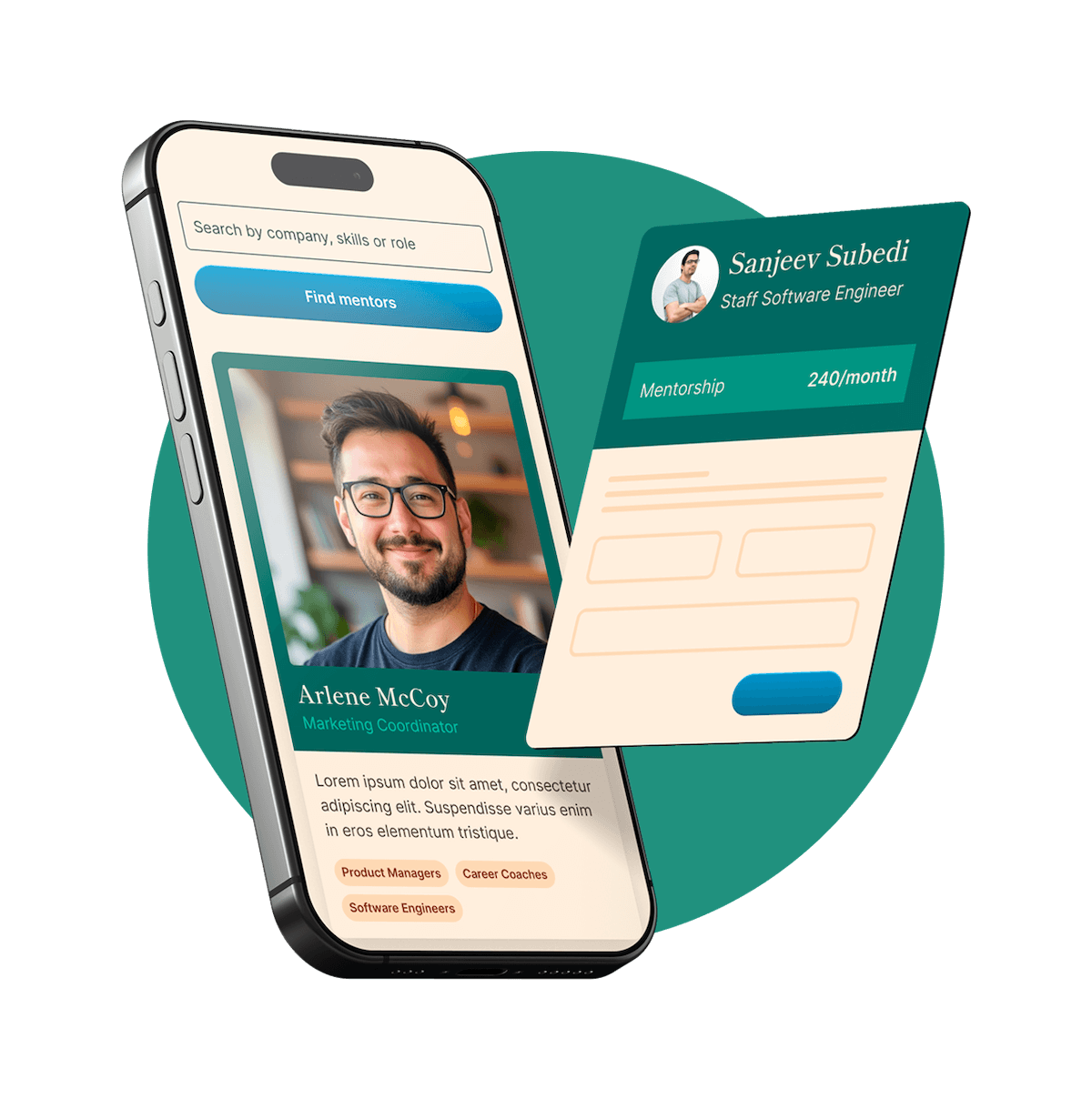
Find your perfect mentor match
Get personalized mentor recommendations based on your goals and experience level
9. How do you handle feedback that is vague, conflicting, or based on personal preference rather than design goals?
I handle it by separating opinion from objective design feedback, then guiding the conversation back to the brief, user needs, and business goals.
If feedback is vague, I ask targeted questions like, “What feels off, clarity, hierarchy, tone, or usability?”
If it’s conflicting, I map each comment to the stakeholder’s priority and look for the shared goal underneath.
If it’s personal preference, I stay open but ask how that preference supports the audience or project objective.
I like offering 2 focused options, then explaining the reasoning behind each one.
When needed, I use the brief, brand guidelines, or user data as a neutral tie-breaker.
In practice, I’ve had stakeholders disagree on homepage visuals. I reframed the discussion around conversion and clarity, presented two routes, and we aligned quickly because the decision was tied to outcomes, not taste.
10. Describe a situation where you had to defend a design decision to a non-designer stakeholder.
I’d answer this with a quick STAR structure, situation, tension, action, result, then keep the focus on how you translated design into business value.
At my last job, a sales director wanted a landing page packed with text, badges, and three CTAs because he felt “more info sells more.” I explained that the page’s job was clarity, not completeness, and showed him heatmap data plus two competitor examples where cleaner hierarchy improved conversion. Instead of arguing aesthetics, I framed it around user behavior and lead quality. We compromised by keeping the strongest proof points above the fold and moving the rest lower on the page. After launch, conversion went up 18 percent, and he became much more open to testing design decisions instead of debating opinions.
11. How do you decide when to use custom illustration, photography, iconography, or stock assets in a design?
I decide it by starting with the message, the audience, and the level of uniqueness the brand needs. Then I match the visual approach to the job instead of forcing one style everywhere.
Custom illustration, when I need a distinct brand voice, abstract ideas, or something playful and ownable.
Photography, when authenticity, emotion, product realism, or human connection matters most.
Iconography, when information needs to be scanned fast, like in dashboards, wayfinding, or feature lists.
Stock assets, when budget or timeline is tight, but only if they feel credible and can be art directed into the system.
In practice, I also look at scalability, licensing, accessibility, and consistency across touchpoints.
Usually the best solution is a mix, like branded illustrations with real photography and a clean icon set to hold everything together.
12. How do you manage multiple design projects with competing deadlines?
I manage it with a mix of prioritization, visibility, and realistic time planning. The goal is to keep quality high without letting urgent work constantly derail everything else.
I start by ranking projects by deadline, business impact, and dependency, not just who asked first.
I break each project into phases, like research, concepts, revisions, and final production, so I can estimate time more accurately.
I use a simple tracker, usually Asana or Notion, to see what is due this week, what is blocked, and what needs feedback.
I build in buffer time, because revisions and stakeholder delays always happen.
If deadlines truly conflict, I communicate early, align on priorities, and negotiate scope, timeline, or support.
In practice, if two campaigns land at once, I lock the higher-impact one first, then narrow deliverables on the second so both stay on track.
13. How do you optimize designs for digital use across different screen sizes and platforms?
I optimize for systems first, then refine for context. The goal is consistency without making everything feel rigid.
Start with responsive layouts, grids, spacing rules, and scalable type.
Design mobile-first, then expand for tablet and desktop based on content priority.
Use platform-aware patterns, iOS, Android, and web each have different UI expectations.
Build reusable components in Figma with variants, constraints, and clear behavior rules.
Test early on real devices for readability, tap targets, contrast, and image performance.
For example, on a recent product page redesign, I created a component system that adapted across breakpoints, swapped image crops by screen size, and simplified interactions on mobile. That kept the experience consistent while improving usability and load speed.
14. What role does accessibility play in your design work, and how do you account for it?
Accessibility is part of the design from the start, not a final checklist. I treat it as both a usability issue and a brand issue, because if people cannot read, navigate, or understand something, the design is not doing its job.
I start with contrast, type size, spacing, and clear hierarchy so content is easy to scan.
I design for keyboard use, focus states, alt text needs, and logical reading order on digital projects.
I avoid relying only on color to communicate meaning, and I test layouts in grayscale sometimes.
I use real content early, because accessibility problems show up fast when the copy gets longer or more complex.
I check work against WCAG standards and collaborate with developers to make sure the final build matches the intent.
For example, on a landing page redesign, I increased contrast, simplified navigation, and improved button labels, which made the page more usable for everyone, not just users with specific needs.
15. How do you evaluate whether a design is successful after it has launched?
I look at success from three angles: business goals, user behavior, and design quality. Before launch, I like to define what success means, so I am not judging it only by taste afterward.
Start with the goal, conversions, sign-ups, retention, engagement, or brand lift.
Gather qualitative feedback, user interviews, support tickets, surveys, stakeholder input.
Compare against the baseline, did the redesign actually improve the original problem?
Review visual and system consistency, accessibility, responsiveness, and edge cases.
For example, if I launched a landing page redesign, I would compare conversion rates to the previous version, watch session recordings to spot friction, and collect sales-team feedback. If conversions rose but users still felt confused, I would treat it as partially successful and keep iterating.
16. Which designers, studios, or movements have influenced your work, and how?
A few big influences shape how I think and design:
Dieter Rams, for restraint, clarity, and making every element earn its place.
Paula Scher, for bold typography and showing that systems can still feel expressive.
Swiss Design and the Bauhaus, for hierarchy, grids, and problem-solving before decoration.
Pentagram and Collins, for turning strategy into visual systems that feel smart and usable.
Editorial designers like Alexey Brodovitch, for pacing, contrast, and letting layout create energy.
In an interview, I’d name 3 to 5 influences, then connect each one to a specific habit in your process. For example, I’ve borrowed Swiss grid discipline in brand and web work, but I balance it with more expressive type choices when a project needs personality, not just order.
17. How do you decide when a design is finished?
I decide a design is finished when it solves the problem clearly, not when I run out of ideas. The goal is communication, not endless polishing.
I check it against the brief, audience, and success criteria first.
I ask, “Is the message instantly clear, and is the hierarchy working?”
I test the practical stuff, readability, responsiveness, accessibility, and production specs.
I remove anything that feels decorative but does not add meaning.
I get a quick second opinion, because fresh eyes catch what I miss.
In an interview, that answer shows restraint and strategy. If you want to make it stronger, add a short example, like tightening a landing page until users could find the CTA faster, then stopping once the metric improved.
18. What factors do you consider when choosing typefaces for a brand or campaign?
I start with the brand’s personality and the job the type needs to do. A luxury skincare brand, for example, needs a very different voice than a youth sports campaign. Then I balance expression with usability, because a typeface can look beautiful and still fail if it is hard to read or too limited across touchpoints.
Brand attributes, tone, audience, and what emotional signal the type should send.
Readability across sizes and formats, from social ads to packaging to web.
Versatility, meaning enough weights, styles, and strong hierarchy options.
Pairing potential, if I need a system with headline, body, and accent fonts.
Technical and licensing needs, including web performance, language support, and budget.
I also test type in real layouts, not just on a font site, because context changes everything.
19. How do you create hierarchy and guide a viewer’s attention in a layout?
I build hierarchy by deciding what the viewer should notice first, second, and third, then designing around that path. The goal is to reduce friction so the eye moves naturally through the content.
Start with one clear focal point, usually the most important message or action.
Use scale first, bigger elements read as more important, then support with weight and color.
Create contrast in type, spacing, and imagery so sections feel distinct.
Use alignment and grids to keep the layout easy to scan and organized.
Control whitespace, it gives priority and prevents everything from competing.
Think in patterns like Z or F scanning, especially for web and editorial work.
If I’m designing a landing page, I’ll lead with a bold headline, support it with a short subhead, then place the CTA where the eye naturally lands.
20. How do you ensure consistency across a suite of assets such as social graphics, presentations, packaging, and web banners?
Consistency comes from building a system first, then designing within it. I usually align on the brand fundamentals early, then create practical tools so every asset feels connected, even across very different formats.
Start with a clear brand kit, typography, color, imagery, icon style, tone.
Build templates and modular components for decks, socials, banners, and packaging.
Define rules for spacing, hierarchy, CTA treatment, logo use, and image cropping.
Test the system across channels early, because what works on packaging may need tweaks for web.
Keep a shared library in Figma or Adobe, so the team pulls from the same source.
Do regular QA checks against the guidelines before anything goes out.
That balance helps maintain consistency without making everything feel repetitive.
21. Tell me about a time you had to redesign an existing asset or identity that was underperforming. What did you change and why?
I’d answer this with a quick STAR structure, situation, task, action, result, then keep the focus on your design thinking, not just the visuals.
At a previous role, I redesigned an event brand identity that felt inconsistent and wasn’t getting much engagement across email and social. The original system had weak typography, too many colors, and no clear hierarchy, so the content was getting lost. I simplified the palette, introduced a stronger type system, built reusable social and presentation templates, and updated the logo lockup for better legibility at small sizes. I made those changes because the brand needed to feel more cohesive, easier to scale, and more readable across channels. After launch, the team saw stronger engagement on promo assets and faster turnaround because the new system was much easier to use.
22. Have you ever had to push back on a request because it would hurt usability, accessibility, or brand integrity? How did you handle it?
Yes, and the best way to answer this is with a quick Situation, concern, action, result flow.
At my last team, marketing wanted a campaign landing page with very light gray text on a photo background because it looked more premium. I pushed back because contrast was too low, mobile readability would suffer, and it also drifted from our brand guidelines around clarity and trust. I did not just say no. I showed a side by side mockup, shared a simple contrast check, and framed it around user experience and conversion, not personal taste. Then I proposed an alternative that kept the visual mood but used a darker overlay and stronger type contrast. They approved it, and the page performed well without compromising accessibility or brand consistency.
23. What are bleeds, trims, safe zones, and why do they matter in production?
In print production, those are the zones that keep a design looking clean after it’s cut.
Bleed is extra artwork that extends past the final size, usually 0.125 inch, so no white edges show if trimming shifts slightly.
Trim is the final cut line, the finished size of the printed piece.
Safe zone is the inner margin where important text and logos should stay, so nothing gets cut off or feels too close to the edge.
They matter because printing and cutting are never 100 percent perfect, there’s always a little movement.
Setting them up correctly avoids costly reprints and makes the file production-ready and professional.
24. What is your workflow for taking a project from concept sketches to polished final files?
My workflow is structured, but flexible enough to adapt as the project evolves.
Start with discovery, clarify goals, audience, brand context, deliverables, timeline, and success criteria.
Research and gather references, then build a moodboard to align visual direction early.
Sketch fast, usually multiple rough concepts first, so I explore ideas before committing digitally.
Move strongest options into digital comps, focusing on hierarchy, composition, typography, color, and usability.
Share 2 to 3 refined directions, collect feedback, and prioritize revisions against the project goals.
Polish the selected route, tighten spacing, consistency, alignment, image treatment, and production details.
Prep final files carefully, organized layers, correct color mode, bleed, exports, naming conventions, and handoff assets.
I also like to build in quick check-ins during the process, so there are no surprises at the end.
25. Which Adobe Creative Cloud tools do you use most often, and how do you decide which tool is right for a particular task?
I use Illustrator, Photoshop, InDesign, and After Effects most often, with Figma alongside them when the project touches digital product work.
Illustrator for logos, icons, vector systems, packaging dielines, anything that needs clean scalability.
Photoshop for image editing, compositing, retouching, mockups, and assets with heavy raster detail.
InDesign for multi-page layouts like brochures, reports, pitch decks, and print-ready documents.
After Effects for simple motion graphics, animated social assets, and bringing brand systems to life.
I choose based on output first, print or digital, static or motion, single asset or system, then file type, collaboration needs, and how easily the work can be handed off.
26. What is your experience with Figma, Sketch, or other collaborative design tools?
I’ve used Figma most heavily for UI design, design systems, and cross-functional collaboration. It’s been my go-to for wireframes, high-fidelity screens, interactive prototypes, and shared libraries, especially when working closely with product managers and engineers in real time.
Figma: component libraries, auto layout, variants, prototyping, dev handoff, and team workshops
Sketch: solid experience with symbol-based systems and plugin workflows, though I use it less now
Adobe CC: Illustrator, Photoshop, and InDesign for brand, asset creation, and production work
Collaboration: comments, version history, shared libraries, and presenting rationale directly in files
Process: I keep files organized, name components clearly, and build systems that scale across teams
What I like most is how these tools support fast iteration without losing structure.
27. How do you organize your files, layers, components, and asset libraries so others can work efficiently with your designs?
I organize for handoff first, not just for myself. The goal is that another designer or developer can open the file and understand it in a minute.
Use a clear folder and page structure, like 00_Cover, 01_Brief, 02_Exploration, 03_Final, 04_Dev Handoff
Name layers and frames by function, not "Rectangle 24", for example Primary Button, Default
Build reusable components with consistent variants, states, and naming conventions
Keep local styles and tokens aligned, color, type, spacing, radius
Publish only approved assets to shared libraries, and archive deprecated items
Add short notes for edge cases, interactions, and responsive behavior
In practice, I also clean files before handoff, remove unused styles, hide abandoned concepts, and check that assets, links, and exports are easy to find.
28. Can you explain the difference between RGB, CMYK, and spot colors, and when each is appropriate?
Think of it by output method and color control.
RGB is light-based, red, green, blue. It is for screens like web, apps, social, video, and digital presentations.
CMYK is ink-based, cyan, magenta, yellow, black. It is for most full-color printing like brochures, magazines, posters, and packaging.
Spot colors are premixed inks, often Pantone. They are used when color accuracy must be exact, like logos, brand colors, metallics, fluorescents, or simple one to three color print jobs.
In practice, I design in RGB for digital work, and switch to CMYK when preparing files for print because some bright RGB colors cannot print accurately. I use spot colors when brand consistency is critical or when a special finish is needed. If a project has both print and digital versions, I check how the brand colors translate across all three.
29. How do you prepare print-ready files for different formats such as brochures, packaging, signage, or large-format graphics?
I start by matching the file setup to the production method, because brochures, packaging, and large-format pieces all fail in different ways if the specs are off. My process is basically, get the printer specs first, build cleanly, then preflight everything before export.
Confirm size, bleed, safe area, fold lines, dielines, substrate, and print method with the vendor.
Work in CMYK or spot colors as required, and check brand color conversions early.
For brochures, I account for panel creep, folds, pagination, and image resolution at final size.
For packaging, I separate artwork from dielines, verify glue/flap areas, and test readability on small panels.
For signage and large format, I scale files appropriately and set resolution based on viewing distance.
Outline or package fonts, embed or link high-res images, and keep layers named clearly.
Run preflight, check overprint, rich black, trapping if needed, then export press-ready PDFs with the printer’s settings.
30. What considerations do you make when designing logos that need to scale across many sizes and applications?
I focus on clarity first. A logo has to work on a favicon, a business card, a storefront, and a social avatar without losing its identity.
Start with a simple, distinctive core shape, not tiny decorative details.
Test it early at very small and very large sizes to catch legibility issues.
Build responsive versions, like full logo, simplified mark, and icon-only.
Keep strokes, spacing, and proportions balanced so it holds up in print and on screen.
Make sure it works in one color, reverse, and black and white before relying on color.
Consider production realities, embroidery, signage, packaging, and low-resolution use.
I also check how it sits in real applications, not just on a clean artboard. Mockups usually reveal scaling problems fast.
31. How do you create original concepts when the market is crowded and many visual approaches already exist?
I start by accepting that originality usually comes from perspective, not inventing a brand new visual language. In a crowded market, I look for what competitors are all saying similarly, then I deliberately search for tension, whitespace, or an emotional angle they are missing.
I map the category first, colors, tone, image styles, messaging patterns.
Then I look beyond the category, fashion, music, editorial, architecture, subcultures.
I define a sharper point of view, who we are for, what we want people to feel.
I generate lots of rough directions fast, usually mixing references in unexpected ways.
Finally, I pressure test concepts against strategy, not just novelty.
For example, if every brand in a space feels polished and minimal, I might explore something more tactile, imperfect, or story-led, as long as it still fits the brand truth.
32. What is your experience with prepress, vendor communication, or working directly with printers?
I’ve worked pretty hands-on with prepress and print production, especially for packaging, retail collateral, signage, and event materials. I usually set files up with correct bleeds, safety margins, dielines, color profiles, rich black usage, overprint settings, and press-ready exports, then do a final preflight before release. I’m comfortable reviewing hard proofs or soft proofs and catching issues like trapping, image resolution, knockouts, or unexpected color shifts.
On the vendor side, I try to make communication really clear and efficient. I’ll confirm specs early, ask about stock, finishes, tolerances, and turnaround, and make sure we align before artwork is finalized. In past roles, I’ve worked directly with printers to troubleshoot things like file errors, material substitutions, and production constraints, which helped avoid delays and reprints. I’ve found that being detail-oriented up front saves a lot of time later.
33. Have you ever used data, analytics, or user feedback to iterate on a design? What did you learn?
Yes. I usually answer this with a quick setup, what data I used, what changed, and the result.
At a previous role, I redesigned a landing page for a product signup flow. After launch, analytics showed strong traffic but a drop-off at the pricing section, and session recordings showed people hesitating there. We also had a few user interviews where people said the value props felt vague. I simplified the layout, made the pricing comparison easier to scan, and rewrote the messaging with clearer hierarchy.
After the update, signup completion improved by about 18 percent. What I learned is that taste gets you started, but evidence helps you make the right call faster. Data told us where the issue was, and user feedback explained why.
34. Tell me about a project where the original concept did not work. How did you adapt?
I’d answer this with a quick Situation, Action, Result flow, then keep the example focused on your decision-making.
On a campaign landing page, my original concept leaned heavily on layered motion graphics and abstract illustration to make the brand feel premium. After early testing, users thought it looked beautiful, but they were missing the core message and not finding the call to action fast enough. I adapted by simplifying the visual hierarchy, reducing motion, tightening the copy with the writer, and swapping in clearer product-focused imagery. I also built two revised versions and reviewed them with marketing and product to align on goals. The final design converted better and taught me that strong design is not just about originality, it is about clarity and performance too.
35. How do you stay current with design trends without producing work that feels generic or short-lived?
I stay informed, but I do not treat trends like instructions. My goal is to understand why something is resonating, then decide whether it supports the brand, audience, and message.
I track trends through design blogs, agency work, product releases, fashion, and culture, not just Dribbble or Behance.
I separate signal from noise by asking, is this solving a communication problem or just looking current?
I build from fundamentals first, typography, hierarchy, composition, and concept, so the work still holds up later.
If a trend fits, I use it selectively, maybe in motion, color, or illustration style, rather than making it the whole identity.
I also look at what has lasted for years in strong brands. That keeps the work feeling fresh, but not disposable.
A good answer in interviews sounds strongest when you balance curiosity with restraint.
36. How do you present your work to clients or internal stakeholders in a way that builds confidence and reduces subjective feedback?
I present work like a business recommendation, not just a visual reveal. The goal is to connect every design choice to the brief, the audience, and the success metrics so feedback stays focused.
Start by restating the problem, goals, audience, and constraints.
Show 1 to 3 strong options max, each with a clear rationale.
Walk through decisions in context, like brand fit, usability, hierarchy, and conversion.
Tie choices to evidence, such as research, testing, prior performance, or brand standards.
Frame feedback with prompts like, “Does this solve the user need?” instead of “Do you like it?”
Be clear on what is flexible and what is intentional.
For example, when presenting a landing page, I lead with the conversion goal, explain why the CTA placement and messaging support that goal, then ask for feedback against performance and audience fit.
37. Have you ever inherited a messy brand system or inconsistent set of templates? What did you do to improve it?
Yes, and I’d answer this with a quick before, action, result structure.
At one company, I inherited marketing templates that had inconsistent fonts, button styles, spacing, and even logo usage across teams. First, I audited everything and grouped the issues into patterns, not one-off mistakes. Then I rebuilt the core pieces, type scale, color usage, grid, components, and example layouts, into a simple brand toolkit people could actually use. I also met with the main users, marketing, sales, and social, to learn where they were getting stuck.
The biggest improvement was making the system practical, not just polished. After rollout, template creation got faster, reviews had fewer revisions, and the brand started looking much more consistent across channels.
38. Describe a time when you had to work closely with copywriters, marketers, developers, or product teams. How did you collaborate?
I’d answer this with a quick STAR structure, situation, task, action, result, then keep the example focused on communication and shared decision-making.
At my last role, I worked on a landing page redesign for a product launch with a copywriter, growth marketer, and front-end developer. My job was to create a visual direction that matched the campaign goals and was realistic to build. I started by aligning everyone on the audience, conversion goal, and key message, then built wireframes the copywriter could write into. I checked in often with marketing on performance goals and with the developer on constraints like component reuse and responsive behavior. That collaboration helped us launch on time, avoid rework, and improve sign-up conversion after release.
39. How do you approach designing for different audiences while keeping the same brand recognizable?
I treat it like a system with flexible expression. The brand should always feel familiar, but the message and visuals need to meet each audience where they are.
Start with the non-negotiables, logo use, color hierarchy, type system, tone, and core brand values.
Define what can flex, imagery style, messaging emphasis, layout density, motion, and channel-specific formats.
Build audience profiles, what they care about, how they consume content, and what visual cues they trust.
Create modular design patterns so each audience gets tailored communication without reinventing the brand.
Test side by side, if two pieces feel too disconnected, tighten the shared elements.
For example, I might keep the same typography and color palette for both Gen Z and enterprise audiences, but use bolder motion and shorter copy for one, and cleaner layouts with more proof points for the other.
40. Tell me about a time you made a mistake in a design project. How did you address it?
I’d answer this with a quick STAR structure: name the mistake, own the impact, explain the fix, then show what changed in your process afterward.
At a previous role, I designed a landing page that looked polished, but I realized after handoff that I had prioritized aesthetics over clarity. The CTA was visually subtle, and early testing showed users were missing the main action. I addressed it by owning it quickly, reviewing the data with the product team, and redesigning the hierarchy, stronger CTA contrast, clearer spacing, and simpler copy flow. We retested it, and conversions improved. The biggest lesson was to validate key user actions earlier, so now I build in quick usability checks before finalizing design.
41. If you were given a campaign that needed to work across print, social, email, web, and event materials, how would you build a cohesive visual system?
I’d start by building a flexible core system, then adapt it by channel without losing the brand thread.
Define the foundation first, logo use, color palette, typography, image style, iconography, and grid rules.
Establish campaign anchors, one big idea, key visual motif, headline style, and clear CTA treatment.
Design modular assets, so layouts can scale from posters to Instagram stories to email headers and event signage.
Create channel-specific rules, like print bleed and hierarchy, social motion or cropping, email responsiveness, and web accessibility.
Package everything into a mini toolkit, templates, specs, examples, and do/don’t guidance for consistency across teams.
In practice, I’d test a few real touchpoints early, like a flyer, landing page, and social post, to make sure the system feels unified, not just theoretically consistent.
42. What is your experience creating and maintaining brand guidelines or design systems?
I’ve worked on both lightweight brand guides for small teams and more robust design systems for growing products. My approach is to make them practical, easy to use, and easy to maintain, not just visually polished.
I usually define core foundations first, logo use, color, typography, spacing, imagery, and tone.
For product work, I build reusable UI components and document states, behaviors, and accessibility rules.
I like using Figma libraries with clear naming, variants, and update notes so teams can adopt changes smoothly.
I’ve maintained systems by setting review cycles, auditing inconsistencies, and partnering with marketing, product, and engineering.
In one role, I cleaned up a fragmented visual system across web and social, which improved consistency and sped up design handoff.
43. How do you handle last-minute changes on a project that is nearly finalized?
I handle it by staying calm, clarifying the real priority, and protecting the timeline without getting defensive. Near-final changes happen, so my job is to adapt while keeping the work strong.
First, I ask what changed, why it changed, and what outcome matters most now.
Then I quickly assess impact on scope, timeline, files, approvals, and production.
I give options, for example, a fast fix for launch or a deeper revision with extra time.
I communicate tradeoffs clearly so stakeholders can make an informed decision.
I update the file structure and versioning carefully to avoid mistakes under pressure.
For example, a client once changed key messaging the day before handoff. I revised the core layouts, flagged what could realistically be updated that day, and delivered a clean priority set first, then the secondary assets right after.
44. How do you approach designing packaging that is both visually compelling and practical for production and retail environments?
I balance brand storytelling with real-world constraints from day one. The best packaging looks great on a mood board, but it also has to survive production, shipping, shelving, and customer handling.
I start with the brand, target customer, price point, and retail context, online, shelf, or both.
Then I design within production realities, dielines, material limits, print methods, finishes, and budget.
I think about shelf impact fast, clear hierarchy, readable type, strong color blocking, and what stands out at 3 to 6 feet.
Practicality matters, so I check durability, stackability, barcode placement, legal copy, and how it opens and reseals.
I like collaborating early with printers and manufacturers to catch issues before final art.
Before launch, I’ll review mockups or prototypes in real lighting and retail-style setups to make sure it performs, not just looks good.
45. Have you worked with templates or production-heavy design environments? How do you maintain quality while moving quickly?
Yes, a lot. I’ve worked in fast-turnaround environments where templates, versioning, and production accuracy matter just as much as creativity, especially for social campaigns, email graphics, print collateral, and multi-size ad sets.
What I do to keep quality high while moving fast:
- Build smart templates with locked brand elements, flexible content areas, and clear type and spacing rules.
- Use naming conventions, layers, and component libraries so files stay clean and easy to hand off.
- Create a quick preflight checklist for alignment, copy, image quality, brand consistency, and export specs.
- Batch similar tasks together, like resizing or versioning, to reduce errors and save time.
- Leave room for one final QA pass, because speed helps, but catching small mistakes is what protects the work.
46. Describe a project where tight budget, time, or resource constraints forced you to be especially strategic.
I’d answer this with a quick STAR structure, situation, constraint, action, result, then keep the focus on how your design decisions protected impact.
At a small startup, I had to launch a product microsite and paid social assets in one week with almost no photo budget and only one developer available part-time. I got strategic by building a lightweight design system first, reusable components, a tight type scale, and a limited color palette, so every asset could be produced fast and still feel consistent. I also used stock selectively, paired with custom illustrations and strong typography to make it feel branded without a full shoot. The result was an on-time launch, lower production costs, and a campaign that outperformed the previous one on click-through rate because the message stayed clear and visually cohesive.
47. How do you respond when a stakeholder asks for something trendy that doesn’t align with the brand or audience?
I’d treat it like a collaboration problem, not a conflict. The goal is to respect their intent, then bring the conversation back to brand fit, audience needs, and results.
First, I’d ask what they like about the trend, usually it’s energy, relevance, or visibility.
Then I’d connect the decision to strategy: brand voice, user expectations, and the campaign goal.
I’d explain the risk in practical terms, like weaker recognition or confusing the audience.
If possible, I’d offer options, one that stays on-brand, and one that borrows a lighter trend element.
I’d use references, mockups, or quick tests so the discussion is based on evidence, not taste.
For example, if someone wanted a viral-style aesthetic for a luxury brand, I’d keep the modern motion or layout pacing, but refine typography, color, and imagery so it still feels premium.
48. What do you think separates good graphic design from great graphic design?
Good design solves the problem clearly. Great design solves it so well that people feel it, remember it, and trust the brand more because of it.
For me, the difference usually comes down to:
- Intent, every choice supports a clear message, audience, and goal.
- Hierarchy, the eye knows exactly where to go first, second, and third.
- Restraint, great work removes noise instead of adding decoration.
- Craft, typography, spacing, alignment, and consistency are handled with real precision.
- Originality with purpose, it feels fresh, but never at the expense of clarity.
A poster can look beautiful, but if it confuses people, it is not great. Great design balances concept and execution, then makes the communication feel effortless.
49. If we asked you to improve one of our existing brand assets, what would your review process look like?
I’d keep it simple and strategic: understand the job the asset is doing, audit what’s working, then improve it without losing brand equity.
Start with the brief, audience, channel, and success metric, so I know what the asset needs to achieve.
Review the current piece for hierarchy, clarity, typography, color, accessibility, and brand consistency.
Compare it against adjacent assets, so the update feels like an evolution, not a random redesign.
Gather input from key stakeholders, but filter feedback through the objective, not personal taste.
Explore 2 to 3 focused directions, usually small to moderate refinements first.
Test the strongest option in context, like mobile, print, social, or web placements.
Finalize with a clear rationale and, if useful, document the update for future consistency.
That process helps me improve performance while respecting the brand system already in place.
50. What kind of design work energizes you most, and what kind do you find most challenging?
I’m most energized by brand systems, editorial layout, and campaign work where strategy and visuals really connect. I like projects that need a strong concept, clear hierarchy, and consistency across touchpoints, because that’s where design can shape how people feel and act. I also enjoy collaborative work with marketers, writers, or product teams, since the best ideas usually get sharper through conversation.
The most challenging work for me is when the brief is vague or feedback is purely subjective, but I actually see that as part of the job. In those cases, I slow things down, ask better questions, and define success early so the design process has something solid to anchor to. Challenging doesn’t mean I avoid it, it just means I’m more intentional.
51. How do you want to grow as a graphic designer over the next few years, and what skills are you currently developing?
Over the next few years, I want to grow from being a strong visual executor into a designer who can connect craft, strategy, and measurable business impact. I want to get sharper at building systems, not just single assets, and take on more ownership in brand evolution, campaign thinking, and cross-functional collaboration.
Right now I’m actively developing:
- motion design, so my work feels more dynamic across digital channels
- UX and product thinking, especially designing with user behavior in mind
- stronger presentation and storytelling skills, so I can explain design decisions clearly
- proficiency in tools like Figma, After Effects, and AI-assisted workflows
- deeper brand strategy knowledge, so I can solve bigger problems, not just make things look good
The goal is to become a well-rounded designer who can contribute creatively and strategically.
Get Interview Coaching from Graphic Design Experts
Knowing the questions is just the start. Work with experienced professionals who can help you perfect your answers, improve your presentation, and boost your confidence.
Still not convinced? Don't just take our word for it
We've already delivered 1-on-1 mentorship to thousands of students, professionals, managers and executives. Even better, they've left an average rating of 4.9 out of 5 for our mentors.