1. Audience, their goals and needs
Everything starts with understanding who is your target udience, what are their goals to be performed. Having good understaning of the goals, it is possible to design the correct user flow that will lead the user through the app.
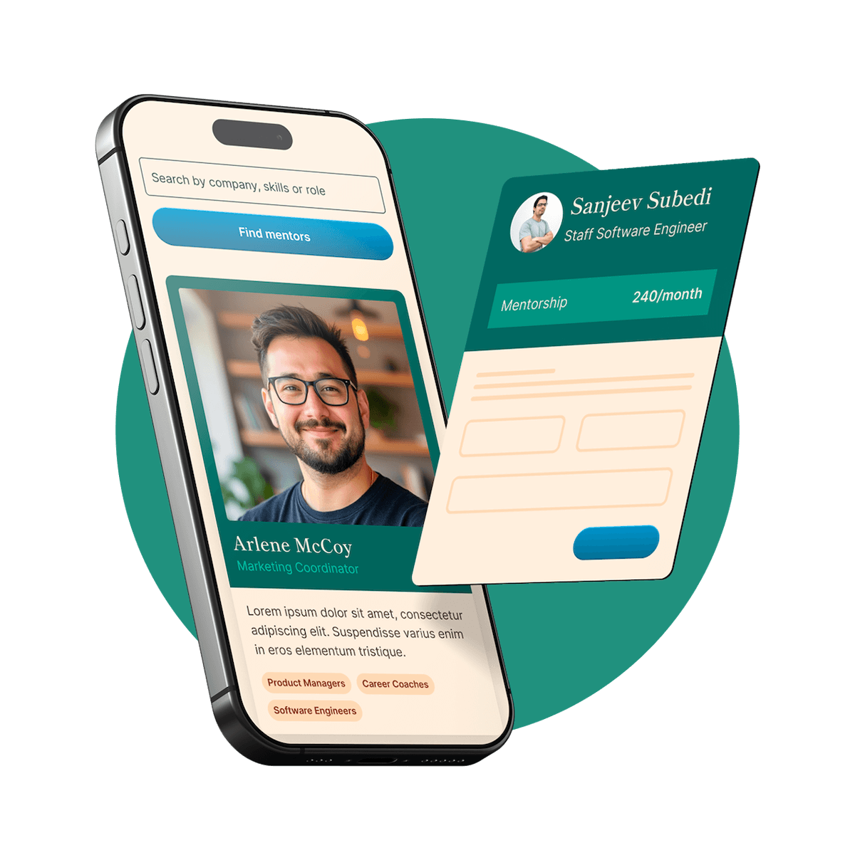
For example, when designing onboarding mobile app, we knew that our target audience - new employees who have just signed up for a contract and waited for their first working day. So, their main goals for them: how to prepare for first day, what to expect in first 3 months onboarding period etc. How did we know it? We interviewed our HR partners and new employees.
2. Functionality
There can be many functions in a mobile app, or maybe just only 2-3. It is important to find a right balance and include those features that will work on the purposes of the mobile app which you develop.
In order to figure out what are the most important functions of the app, we used MSCW prioritization method. The acronym MSCW represents four categories: must-have, should-have, could-have, and won't-have, or will not have right now. We categorized all features according to this method and then put them into development roadmap.
3. Navigation and information architecture
Good information architecture means that the objects are related to each other and named in accordance with users expectations: this concerns hierarchy, linkage, data structure.
In order to provide clear navigation through the app, you need to understand who, why and how often will use it.
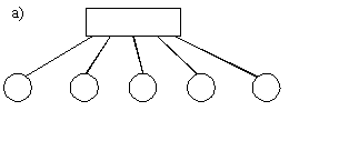
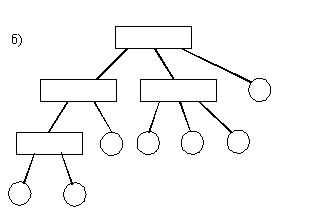
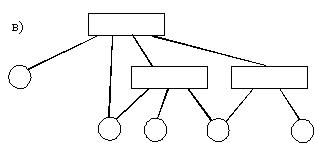
Navigation could be:
a) single-level - the app has several single-level sections, user need to switch between which them
b) hierarchical - each subsequent section goes deeper into the other
c) dependent on content/behavior - navigation may change during the usage of app
4. Animation and micro-interactions
Microinteractions perform one small task in an app. All micro-interactions are digitally animated. Animation helps communicate the state of an element, draw additional user's attention, show the result of actions, and even influence user behavior.
Examples of micro-interactions:
- Scrollbar. Gives visual feedback to the user changing location within a page.
- Pull-to-refresh animation. Gives visual feedback to a user action.
- Swipe animation. Gives visual feedback that a user has swiped an element.
- Notification. Provides the user with feedback that a new notification has arrived.
- And so on...
5. Texts and terminology
1) Brevity is the sister of talent :)
2) Express yourself clearly. If there are some common words to express name of buttons or other elements, use those common words.
3) Try to avoid specific terms and abbreviations, because your users might not be familiar with those terms (if it is not an academic wrtiting)
4) Do not mix formal and informatl style in communicaiton, choose one style and keep consistency along the whole user journey
5) Be friendly, respectful and attentive to users
6. Design
a) design guidelines
Carefully study the platform guidelines, for Andoid it's Material Design, for iOS it's Human Interface Guidelines
Remember that if you're not following platform guidelines, your mobile app might be rejected by App Store and Google Play when you decide to submit it. The App Store has the strictest approval process of all app marketplaces.
b) typography
For mobile devices, use 30-40 characters per line, which is half of the recommended 60-75 characters for desktop.
For Android use Roboto font; for iOS - San Francisco font.
I don't recommend you using custom fonts, because they might not be supported and displayed correctly on different devices and operating systems.
Also remember that if you're going to localize your content to different languages, save more space for localized text in your designs. Ask native spaekers to check your translations whever it's possoble to avoid mistakes since even the most advanced dictionaries do not take into account the nuances of a foreign language.
c) colors
Simplifying the color scheme improves the user experience, while too many colors can be distracting. Use one main color and shades for accents.
d) photos
It's great to use photos, but there should be some functionality behind them too :)
For example, showing photos of real company employees enjoying time together can be great illustration of company value "One Team".
And, most importantly, when developing a mobile app, you need to remember that all of the features must be tested on real users at the stage of prototype. This will help you to save time and money on development and improve usability.