Introduction
I was recently asked to explain the AUC for ROC Curve at work. Although I understand the mathematics behind it, I found it difficult to explain in simple terms. This got me thinking and I decided to write this article. The purpose is to present a simple, intuitive understanding along with mathematical explanation using an example. I am avoiding textbook definitions and references on purpose to keep the readers focused on the intuition.
Here’s the code used in this article.
Every data scientist goes through a phase of evaluating classification models. Amidst an array of evaluation metrics, Receiver Operating Characteristic (ROC) curve and the Area Under the Curve (AUC) is an indispensable tool for gauging model’s performance. In this comprehensive article, we will discuss basic concepts and see them in action using our good old Titanic dataset.
Section 1: ROC Curve
At its core, the ROC curve visually portrays the delicate balance between a model’s sensitivity and specificity across varying classification thresholds.
To fully grasp the ROC curve, let’s delve into the concepts:
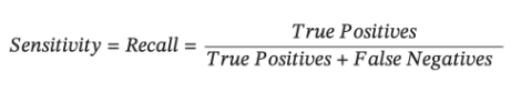
- Sensitivity/Recall (True Positive Rate): Sensitivity quantifies a model’s adeptness at correctly identifying positive instances. In our Titanic example, sensitivity corresponds to the the proportion of actual survival cases that the model accurately labels as positive.
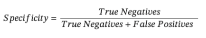
- Specificity (True Negative Rate): Specificity measures a model’s proficiency in correctly identifying negative instances. For our dataset, it represents the proportion of actual non-survived cases (Survival = 0) that the model correctly identifies as negative.
- False Positive Rate: FPR measures the proportion of negative instances that are incorrectly classified as positive by the model.
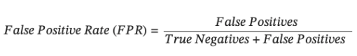
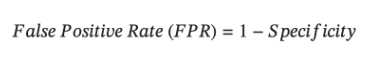
Notice that Specificity and FPR are complementary to each other. While specificity focuses on the correct classification of negative instances, FPR focuses on the incorrect classification of negative instances as positive. Thus-
Now that we know the definitions, let’s work with an example. For Titanic dataset, I have built a simple logistic regression model that predicts whether the passenger survived the shipwreck or not, using following features: Passenger Class, Sex, # of siblings/spouses aboard, passenger fare and Port of Embarkation. Note that, the model predicts the ‘probability of survival’. The default threshold for logistic regression in sklearn is 0.5. However, this default threshold may not always make sense for the problem being solved and we need to play around with the probability threshold i.e. if the predicted probability > threshold, instance is predicted to be positive else negative.
Now, let’s revisit the definitions of Sensitivity, Specificity and FPR above. Since our predicted binary classification is dependent on the probability threshold, for the given model, these three metrics will change based on the probability threshold we use. If we use a higher probability threshold, we will classify fewer cases as positives i.e. our true positives will be fewer, resulting in lower Sensitivity/Recall. A higher probability threshold also means fewer false positives, so low FPR. As such, increasing sensitivity/recall could lead to increased FPR.
For our training data, we will use 10 different probability cutoffs and calculate Sensitivity/TPR and FPR and plot in a chart below. Note, the size of circles in the scatterplot correspond to the probability threshold used for classification.
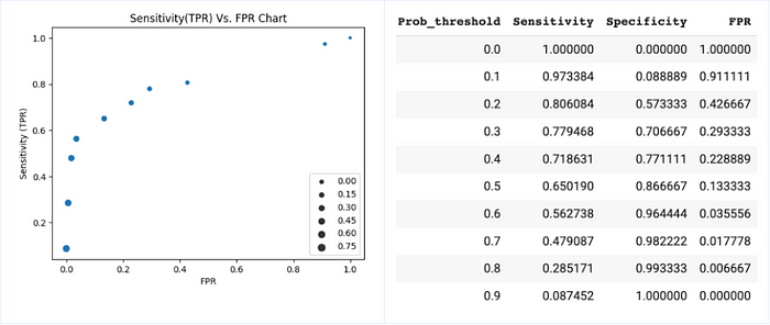
Well, that’s it. The graph we created above plots Sensitivity (TPR) Vs. FPR at various probability thresholds IS the ROC curve!
In our experiment, we used 10 different probability cutoffs with an increment of 0.1 giving us 10 observations. If we use a smaller increment for the probability threshold, we will end up with more data points and the graph will look like our familiar ROC curve.
To confirm our understanding, for the model we built for predicting passenger’s survival, we will loop through various predicted probability thresholds and calculate TPR, FPR for the testing dataset (see code snippet below). Plot the results in a graph and compare this graph with the ROC curve plotted using sklearn roc_curve function.

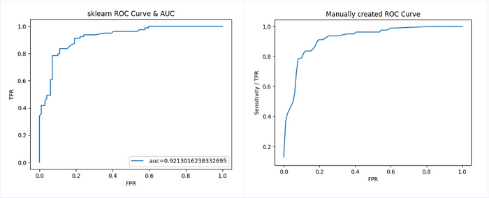
As we can see, the two curves are almost identical. Note the AUC=0.92 calculated using roc_auc_score function. We will discuss about this AUC in the later part of this article.
To summarize, ROC curve plots TPR and FPR for the model at various probability thresholds.Note that, the actual probabilities areNOT displayedin the graph, but one can assume that the observations on the lower left side of the curve correspond to higher probability thresholds (low tpr), and observation on the top right side correspond to lower probability thresholds (high tpr).
Section 2: AUC
Now that we have developed some intuition around what ROC curve is, the next step is to understand Area Under the Curve (AUC). But before delving into the specifics, let’s think about what a perfect classifier looks like. In the ideal case, we want the model to achieve perfect separation between positive and negative observations. In other words, the model assigns low probabilities to negative observations and high probabilities to positive observations with no overlap. Thus, there will exist some probability cut off, such that all observations with predicted probability < cut off are negative, and all observations with probability >= cut off are positive. When this happens, True Positive Rate will be 1 and False Positive Rate will be 0. So the ideal state to achieve is TPR=1 and FPR=0. In reality, this does not happen, and a more practical expectation should be to maximize TPR and minimize FPR.
In general, as TPR increases with lowering probability threshold, the FPR also increases (see chart 1). We want TPR to be much higher than FPR. This is characterized by the ROC curve that is bent towards the top left side. The following ROC space chart shows the perfect classifier with a blue circle (tpr=1 and fpr=0). Models that yield the ROC curve closer to the blue circle are better. Intuitively, it means that the model is able to fairly separate negative and positive observations. Among the ROC curves in the following chart, light blue is best followed by green and orange. The dashed diagonal line represents random guesses (think of a coin flip).
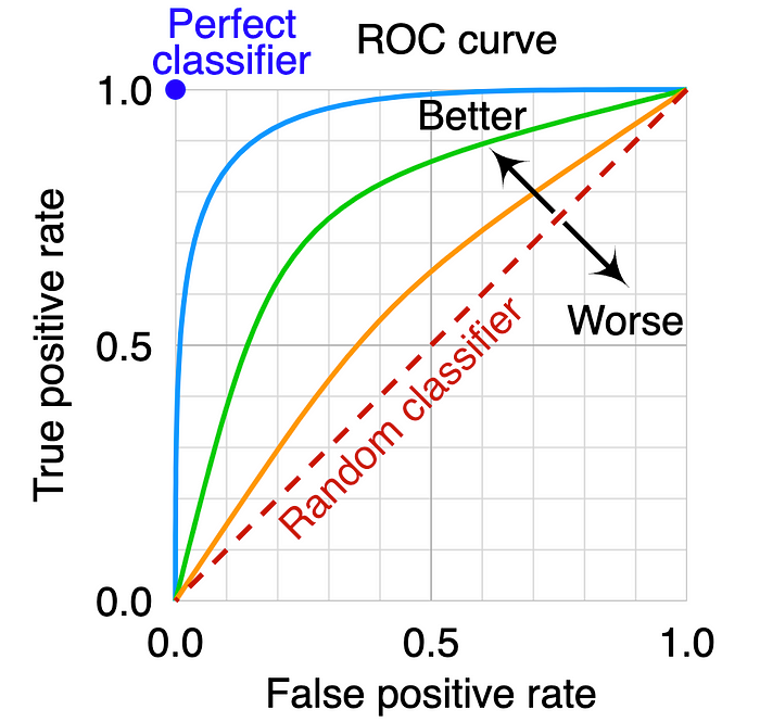
Now that we understand, ROC curves skewed to the top left are better, how do we quantify this? Well, mathematically, this can be quantified by calculating the Area Under the Curve. The Area Under the Curve (AUC) of the ROC curve is always between 0 and 1 because our ROC space is bounded between 0 and 1 on both axes. Among the above ROC curves, the model corresponding to the light blue ROC curve is better compared to green and orange as it has higher AUC.
But how is AUC calculated? Computationally, AUC involves integrating the ROC curve. For models generating discrete predictions, AUC can be approximated using the trapezoidal rule. In its simplest form, trapezoidal rule works by approximating the region under the graph as a trapezoid and calculating its area. I’ll probably discuss this in another article.
This brings us to the last and the most awaited part- How to intuitively make sense of AUC? Let’s say you built a first version of a classification model with AUC 0.7 and you later fine tune the model. The revised model has an AUC of 0.9. We understand that the model with higher AUC is better. But what does it really mean? What does it imply about our improved prediction power? Why does it matter? Well, there’s a lot of literature explaining AUC and its interpretation. Some of them are too technical, some incomplete and some outright wrong! One interpretation that made the most sense to me is:
AUC is the probability that a randomly chosen positive instance possesses a higher predicted probability than a randomly chosen negative instance.
Let’s verify this interpretation. For the simple logistic regression we built, we will visualize the predicted probabilities of positive and negative classes (i.e. Survived the shipwreck or not).
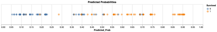
We can see the model performs pretty well in assigning a higher probability to Survived cases than those that did not. There’s some overlap of probabilities in the middle section. The AUC calculated using auc score function in sklearn for our model on the test dataset is 0.92 (see chart 2). So based on the above interpretation of AUC, if we randomly choose a positive instance and a negative instance, the probability that the positive instance will have a higher predicted probability than the negative instance should be ~92%.
For this purpose, we will create pools of predicted probabilities of positive and negative outcomes. Now we randomly select one observation each from both the pools and compare their predicted probabilities. We repeat this 100K times. Later we calculate % of times the predicted probability of a positive instance was > predicted probability of a negative instance. If our interpretation is correct, this should be equal to AUC.

We did indeed get 0.92! Hope this helps.
Let me know your comments and feel free to connect with me on LinkedIn.