Master your next UX Research interview with our comprehensive collection of questions and expert-crafted answers. Get prepared with real scenarios that top companies ask.


Prepare for your UX Research interview with proven strategies, practice questions, and personalized feedback from industry experts who've been in your shoes.
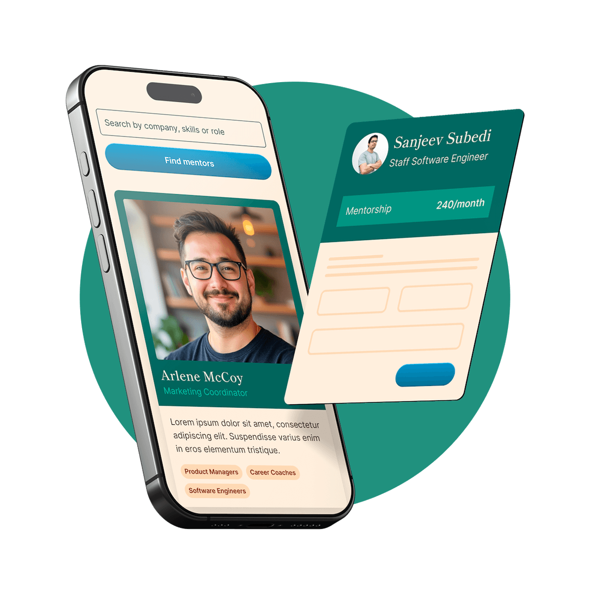
Thousands of mentors available
Flexible program structures
Free trial
Personal chats
1-on-1 calls
97% satisfaction rate
Choose your preferred way to study these interview questions
I’d define a successful user experience with a simple lens:
So in practice, good UX is:
I usually think about success as the overlap between user outcomes and business outcomes.
For users, that might mean:
For the business, that might mean:
So if users can accomplish their goal with minimal effort, and the experience also drives the right business impact, that’s a successful UX.
Absolutely. One of the most impactful projects I led the research on was a mobile app for a travel company. The goal was to improve user retention and increase the number of hotel bookings done through the app.
The project began by setting up clear objectives and identifying the main questions we were looking to answer. We needed to understand why users were downloading the app but not consistently using it for their travel needs. I conducted an initial analysis through analytics review and one-on-one interviews with app users. This highlighted some usability issues and confusion around app features.
Next, I designed and executed usability testing to dive deeper into these issues. We had users complete tasks and observed how they interacted with the app, noting difficulties and listening to their feedback. From there, we started seeing some patterns. Many users found the app difficult to navigate, and there was confusion about how to book hotels directly on the app.
Sharing these findings with the development team led to a complete redesign of the app's navigation and refinement of its booking feature. We ran follow-up tests to verify the positive impact of these changes before the final launch. The result was a 35% increase in user retention and a 50% bump in hotel bookings, a clear testament that the research-led changes had a significant impact.
I’d answer this in a simple flow: goal, plan, recruit, run, synthesize, share. That keeps it structured and shows you know how to go from a question to a decision.
Here’s how I’d say it:
I usually start by getting really clear on the purpose of the test.
From there, I turn that into a few focused research questions and realistic tasks. I want tasks to reflect what users would actually do, not what I want to prove.
For example, if we’re testing a new checkout flow, I might ask participants to:
Next, I think about who we need to test with.
I’d create a screener and recruit participants who match the audience closely enough to give us useful feedback. Usually I’m aiming for around 5 to 8 participants per key segment for moderated usability testing, depending on timeline and risk.
When I run the sessions, I try to keep it conversational but consistent.
I’m usually looking for things like:
I also like to capture severity, not just issues. A small annoyance and a true blocker shouldn’t be treated the same way.
After the sessions, I synthesize patterns across participants.
Then I share findings in a way the team can act on quickly. Usually that means:
If I’m working closely with design and product, I’ll often turn those findings directly into design questions or next-step experiments.
A concrete example:
I tested an onboarding flow for a B2B SaaS product where conversion was dropping between account creation and setup.
My process was:
Align on the goal
We wanted to understand why users were abandoning setup and whether the flow felt clear enough for first-time users.
Build tasks
I asked participants to create an account, connect their first data source, and complete the initial setup steps.
Recruit the right people
We recruited participants who matched the target buyer and had similar technical comfort to actual customers.
Moderate the sessions
During testing, I noticed several participants got stuck on a permissions screen. They didn’t understand why access was needed, and some hesitated because the language felt too technical.
Synthesize and recommend
I grouped issues by frequency and severity, then shared a few clear recommendations:
After the team made those changes, we retested and saw a much smoother experience, with fewer setup failures and better completion rates.
That’s usually how I approach user testing, structured enough to be rigorous, but lightweight enough to move with the product team.
Try your first call for free with every mentor you're meeting. Cancel anytime, no questions asked.

I like to keep journey mapping practical, not just a pretty artifact.
A simple way to structure the answer is:
In practice, my process looks like this:
I also align on the user segment, the business goal, and what decisions the map needs to support.
Pull together research
I’m looking for a clear picture of what users are trying to do, what steps they take, where they get stuck, and how they feel along the way.
Break the journey into stages
The stages depend on the product and the question we’re trying to answer.
Map each stage in detail For each stage, I usually capture:
This is where the map starts telling a story, not just listing steps.
I want the team to be able to look at the map and quickly answer, "Where should we focus first?"
Validate and socialize it
That helps make sure the map is accurate and that people trust it.
Make it useful
A quick example:
At a previous company, I created a journey map for new users trying to onboard into a B2B platform.
That led us to: - simplify the initial setup flow - improve in-product guidance - clarify the first key action users needed to take
The journey map helped the team align around the real problem, and it shifted the roadmap from fixing sign-up friction to improving activation.
A good way to answer this is:
Most of my UX research work has been in pretty cross-functional environments. I usually partner closely with:
What I enjoy about that setup is that research becomes much more useful when it is shared early and often, not just handed over at the end.
One example was a news app redesign I worked on.
I partnered with the PM early to help shape the research questions and make sure we were solving the right problem. From there, I worked with design on the discussion guide, ran the research, and then brought findings back to the team in a way that was easy to act on.
A few things I focused on:
That helped us stay aligned as a team and make decisions faster. It also created a more collaborative environment, because people felt involved in the process rather than just receiving research at the end.
For me, strong cross-functional work is really about empathy, clarity, and knowing how to connect user needs to each team’s priorities.
A good way to answer this is:
In practice, I try to build accessibility into both the research process and the design recommendations.
For example, on a public transportation website redesign, we knew the audience included people with visual, motor, and cognitive accessibility needs. So I adjusted the approach in a few ways:
I also try not to assume what people need, so whenever possible, I include participants with accessibility needs in research. That usually surfaces issues you would not catch from guidelines alone.
What I have learned is that accessibility changes the quality of the experience for everyone, not just a subset of users. In that project, the clearer structure and simpler interactions helped all riders complete tasks faster, especially on mobile and under time pressure.
The scope of my research is primarily defined by the project goals and constraints, such as time, budget, and resources. To decide on the scope, I start by understanding the key questions we are trying to answer through the research. Is it to understand user needs, evaluate a design, or diagnose usability issues?
For instance, if we're looking to get an in-depth understanding of user needs at the start of a project, we'd likely scope for a larger, more comprehensive study that could include ethnographic observations, surveys, and interviews.
However, if we're testing a specific feature or element of an interface, we might opt for a focused usability test with a smaller participant pool. Budget and time often influence how broadly we can conduct research, so it's important to prioritize aspects that will give the most valuable insights.
Essentially, the scope depends on the problem to be solved, what we need to learn, and the resources available to answer those questions effectively. It's a balance of getting the depth and breadth of information necessary to drive the design process within the given constraints.
My approach is pretty simple, document as I go, synthesize fast, and share findings in the format people will actually use.
I usually structure it in 3 parts:
Here’s what that looks like in practice.
Once sessions are done, I synthesize quickly.
When I share results, I try not to make it one-size-fits-all. Different people need different levels of detail.
I usually create:
I also like to include:
For example, on a recent project, I ran a set of usability interviews on an onboarding flow. I documented each session right after it ended, while everything was still fresh. Then I synthesized the data into a few clear themes, where users got confused, where trust dropped, and where they needed more guidance.
To share it, I made:
That helped the team align quickly, and it made the research reusable later instead of disappearing into a slide deck.
Get personalized mentor recommendations based on your goals and experience level
Start matchingI try to reduce bias at every stage of the study, not just during interviews.
A simple way to structure this answer is: 1. Prevent bias in the plan 2. Reduce bias during data collection 3. Check for bias in analysis and reporting
In practice, I focus on a few things:
That usually means screening for things like experience level, behavior, demographics, or product usage, depending on the study.
Write neutral tasks and questions
Instead of asking, "How helpful was this feature?" I would ask, "What stands out to you here?" or "How would you use this?"
Standardize moderation
During sessions, I stay neutral, give people space, and avoid reacting in ways that might influence their answers.
Be aware of my own assumptions
That helps separate what we think will happen from what participants actually do.
Validate the analysis
If possible, I review findings with another researcher, designer, or PM to sanity check interpretations and catch confirmation bias.
Report the full picture
For example, in a usability study for a new onboarding flow, the team was convinced first-time users were dropping off because the instructions were unclear. I made sure we recruited a mix of true new users, not just internal proxies or power users. I rewrote a few questions that initially felt too leading, and during sessions I stuck closely to neutral prompts.
When we analyzed the results, the real issue was not the wording. It was that users did not understand what would happen after the first step. Because we had kept the study neutral, we avoided confirming the team's original assumption and were able to recommend the right fix.
In one of my projects where we were redesigning the website for a luxury fashion brand, our initial assumption was that high-quality visuals were the most important factor for users. We believed that great imagery would lead to browsing and eventually purchasing.
However, when we conducted a series of user interviews, surveys, and usability testing, we found that photo quality, while important, wasn't the driving force behind purchase decisions. Instead, users found the sizing information confusing and shipping information difficult to find. This was significantly impacting their willingness to purchase from the site.
These findings were completely unexpected – we had thought imagery was going to be the main pain point. But research results directed our focus towards improving the sizing guide and making logistical information (like shipping and returns) more visible. This pivot led to an increased conversion rate on the website after relaunch, highlighting the value of approaching UX research with an open mind, ready for surprises.
Absolutely. In a project I worked on, the product team had decided to add multiple new features to our app based on competitive analysis. They believed these features would help set us apart and attract more users. However, from my user research and existing data, there was little evidence to suggest our users felt these features were missing or had any interest in them.
I voiced my concern about this approach, given that implementing these features would divert resources and might potentially complicate the user experience. I presented my research findings and user feedback to the team, and suggested that it would be more beneficial to focus our efforts on improving existing features and addressing known pain points for our users.
The team was initially resistant, but we agreed to conduct user tests on a mockup incorporating the new features. The results clearly showed that users found them confusing, supporting my initial concerns. As a result, we decided to focus on refining our existing offering, which turned out to be a successful approach.
This situation reinforced that data-driven arguments can be very persuasive, and it also highlighted the value of constructive disagreement within a team as it can lead to better decisions and outcomes.
I’d keep this simple: connect UX research to their goals, not to research jargon.
A good way to structure the answer:
Then I’d answer like this:
When stakeholders are unfamiliar with UX research, I avoid leading with methods. I lead with outcomes.
I’d frame it as, "UX research helps us reduce guesswork. It tells us whether we’re solving a real user problem, before we spend time and money building the wrong thing."
A few points I’d usually emphasize:
I’d also tailor the message to the audience:
Then I’d back it up with a real example.
At a previous company, there was skepticism about doing research before launching a new onboarding flow. The feeling was, "We already know what users need."
So instead of pushing for a big research project, I proposed a quick round of usability testing with five target users.
What we found was pretty clear:
Because of that, we made a few targeted changes before launch.
The result:
That experience helped shift the conversation. Stakeholders stopped seeing research as extra process, and started seeing it as a practical tool for making smarter decisions.
If I’m trying to build buy-in over time, I also make research visible:
That usually works well, because once stakeholders hear real users struggle with something, the value of research becomes much easier to understand.
I usually answer this in a simple flow, because usability testing is really about making good decisions at each stage:
In practice, my approach looks like this:
Define the goal first
I want to know what the team is trying to learn. Are we testing discoverability, comprehension, task success, trust, or overall ease of use? I try to narrow it down to a few specific questions so the study stays focused.
Choose the right format
I decide between moderated or unmoderated, remote or in-person, based on the product and the risk level.
In-person helps when the context or environment really matters
Recruit the right participants
I look for people who reflect the actual audience, not just generic users. That could mean filtering for experience level, behavior, tools they use, or specific needs, depending on the product.
Design realistic tasks
I write tasks around scenarios, not instructions. I do not want to tell people what to click. I want to see how they naturally interpret the interface.
More, "You are comparing options and want to understand what this plan would cost your team"
Run the sessions and stay neutral
During the session, I am mainly watching for where people hesitate, backtrack, make assumptions, or get stuck. I ask follow-up questions, but I try not to lead them. I also pay attention to confidence, not just completion. Someone can finish a task and still have a poor experience.
Synthesize quickly and tie findings to severity
Afterward, I group patterns across participants, identify root causes, and separate minor friction from issues that really block people. I like to pair findings with evidence, impact, and a recommendation so the team can act on them right away.
Share results in a usable way
I tailor the readout to the audience. Designers may want detailed interaction issues, while product managers may want risk areas and priorities. I usually keep it tight, clips and examples if possible, plus a clear list of what should change now versus later.
For example, I recently tested an onboarding flow for a SaaS product.
The outcome:
In follow-up testing, users moved through onboarding with a lot more confidence and fewer drop-offs.
That is usually my approach, structured enough to be rigorous, but lightweight enough to keep pace with product teams.
Determining the research questions for a new project typically begins with a thorough understanding of the project goals and understanding the context. I start by discussing with stakeholders to understand their vision and objectives for the project, as well as their assumptions and any known challenges.
Then, I assess any existing data or research related to the project. This could include analytics, sales data, customer service logs, or previous research studies. By identifying gaps in understanding or aspects that require further investigation, it helps to form the initial set of research questions.
Next, user needs and behavior come into play. By hypothesizing the user's needs and potential behaviors in relation to the product or interface, we can begin building questions that will validate or challenge these assumptions.
Ultimately, the process involves aligning the business goals, user needs, and project context to frame questions that will drive effective design and decision-making. The goal is to choose questions that, when answered, significantly increase our understanding and help move the project forward successfully.
I recall when I was working on a project for a financial tech startup. They were very proud of their unique graphical approach to displaying investment data but during user testing, it became evident that users were confused and struggled to interpret the information correctly.
Delivering this feedback was challenging, especially because the design team was attached to their unique, visually striking concept. However, I presented my feedback along with clear evidence from the user testing. I walked them through the tasks participants struggled with, showed them the data, and played back snippets of recorded user feedback to underscore the message.
Even though the feedback was tough, framing it around the user experience - the confusion they felt and errors they made - was powerful and helped the team understand the need for changes. It was indeed a delicate conversation, but being factual, empathetic, and focusing on the shared goal of creating a product the users would love, helped the team see past their initial disappointment and led to a more user-friendly design.
The choice between quantitative and qualitative research largely depends on what we are trying to understand.
If we need to gather hard numbers, measure behaviors, or want to validate hypotheses at scale, that's where quantitative research comes in. For example, analytics data, surveys or A/B testing can provide statistical evidence about how many users clicked a particular button or how the change in a feature impacted user behavior.
On the other hand, if the goal is to dive deeper into user motivations, feelings, and their "why", I would go for qualitative research. Methods like user interviews, focus groups or contextual inquiries provide rich, detailed insights that can help understand users' attitudes, goals, and pain points
Typically, in UX research, these methods are not mutually exclusive, but are rather used in a complementary manner. At different stages in a product development lifecycle, I might skew more towards one than the other to gather the most relevant insights, but ideally, a mix of both helps to get a comprehensive understanding of the user experience.
Certainly. In a previous role, I was involved in a project for an e-commerce company that was looking to improve their app's product discovery experience. The initial assumption was to enhance the search functionality as it was a commonly used feature.
However, upon conducting user interviews and surveys, we found that many users felt overwhelmed by the vast amount of choices and often faced difficulty in deciding what to buy when they didn't have a specific product in mind.
In response to this, our research suggested introducing a feature for personalized product recommendations and style guidance. This was a significant departure from the company's initial plan of focusing on search. But the research made it clear that helping users discover products relevant to their taste would address a major pain point.
Upon implementation, not only did this feature increase user satisfaction with the discovery experience, but it also led to an increase in average order value. This example truly underscores the power of research in driving impactful design decisions that align with user needs.
This is a common occurrence in user research studies. It's important to let the user express themselves while still ensuring the research remains focused on the objectives.
If a participant goes off topic, I would patiently listen to them initially. Sometimes, even off-topic discussions can provide interesting insights about user context or the larger ecosystem of their experiences.
However, if it starts consuming too much time or strays significantly, I would gently steer the conversation back to the topic. This could be done with a transitional phrase like, "That's interesting, thanks for sharing that. Now, can we talk a bit more about…".
It's crucial not to abruptly cut-off or ignore their off-topic comments, as this could make them feel ignored and alter the flow of the conversation. Guiding the conversation with tact and respect ensures the participant stays engaged, and the research yields relevant insights.
Yes, combining data analytics with other research methods is a staple in my approach to UX research. It enables me to validate qualitative insights with quantitative data, and vice versa.
One example is a project I worked on to optimize a mobile app's signup flow. We had qualitative data from user testing sessions that suggested users were abandoning sign up due to its length and complexity. However, before making any recommendations, we needed to quantify the issue.
Here, metrics from our data analytics platform came in incredibly handy. Looking at the funnel analysis, we saw a significant drop-off at the third step of the signup process, which involved a complex form filling. This quantitative data corroborated with our user testing feedback, demonstrating that it wasn't just a few users, but a considerable percentage of users facing the same issue.
Armed with both qualitative and quantitative insights, we were able to present a compelling case to the team. The result was a simplified, more streamlined sign-up process that noticeably increased our registration completion rate.
Incorporating data analytics enhances the impact of UX research by painting a complete picture using hard numbers and real user experiences.
During a typical UX project, the research might include different methods that collect both qualitative and quantitative data. Consolidating these findings involves keeping overarching research goals in mind and looking for patterns or commonalities.
For qualitative data from methods like interviews or observation, I identify themes or behavioral patterns. I pay attention to user sentiments, needs, motivations, and pain points. In parallel, I analyze quantitative data, such as from surveys or analytics, to find patterns and trends in user's actions.
Then, I review both sets of findings side by side to see where they intersect, complement, or contradict each other. For instance, the 'why' behind a specific behavior observed in the analytics can often be derived from qualitative feedback. Conversely, a theme emerging from interviews could be validated or informed further with quantitative data.
Finally, I summarize these merged insights in a way that communicates the story of my findings. This could be in the form of user personas, journey maps, or a research report. The goal is to integrate these diverse findings into a cohesive understanding that fuels informed design decisions. It's about painting a full picture of the user and their interaction with the product.
I usually handle difficult stakeholders by lowering the temperature first, then getting very clear on what is actually driving the tension.
A simple way to structure the answer is:
Understand the resistance
Is it about timeline, risk, ego, budget, or lack of context?
Align on shared goals
Bring the conversation back to what everyone cares about, like user outcomes, business impact, or delivery confidence.
Use evidence, not opinion
Ground the discussion in research findings, customer quotes, usability clips, or data.
Make it easy to move forward
Offer options, tradeoffs, or a small next step instead of forcing a big decision.
For example, on one project I had a product stakeholder who kept pushing back on research findings because they felt the recommended changes would slow down the launch.
Instead of debating in a meeting, I set up a 1:1 and tried to understand their concern. It turned out they were not against the insights, they were worried about missing a deadline they were already under pressure for.
Once I understood that, I reframed the conversation around risk. I showed which issues were true blockers for users, and which ones could wait for a later iteration. I used a few short video clips and direct user quotes so the problems felt concrete, not theoretical.
Then I proposed a phased plan:
That changed the tone completely. It stopped being research versus delivery, and became a shared prioritization conversation.
In general, I have found that difficult stakeholders usually become much easier to work with when they feel heard, understand the evidence, and see a practical path forward.
Conducting a heuristic evaluation involves systematically reviewing a product or website against established usability principles, or heuristics.
I would start by selecting appropriate heuristics for the evaluation. Jakob Nielsen’s 10 usability heuristics are commonly used, but depending on the project, additional or different heuristics might be more suitable.
Next, I would familiarize myself with the product or website to understand its purpose and main tasks users need to accomplish. Then, I start the evaluation, going through each heuristic one by one and critically examining the interface to evaluate its adherence. For example, under 'User control and freedom,' I would check if users can easily undo their actions.
As I progress, I would note down every issue I identify, capturing the screen where it occurs and the heuristic it violates. It's important to be systematic, thorough, and cover all parts of the product or website.
Once all identified issues are noted, I would analyze and prioritize them based on the severity, frequency, and potential impact on users. This can be presented in a heuristic evaluation report, detailing the findings and providing recommendations for improvement.
Heuristic evaluations are useful as a quick, cost-effective method to identify major usability issues. However, since they're based on expert judgement, they should ideally be combined with user-based methods to get a fuller picture of the usability.
A strong way to answer this is to keep it in 4 parts:
Here’s how I’d say it:
I led a checkout research project for an e-commerce product where the team was seeing a lot of cart abandonment, but we didn’t have a clear picture of why.
My role was end-to-end. I owned the research plan, stakeholder alignment, execution, analysis, and readout.
A few things I did up front:
For coordination, I like to keep things really structured but lightweight. In this project, that meant:
During the study, I moderated the sessions myself. I observed how people moved through checkout, where they hesitated, what confused them, and what made them lose confidence. I also made sure key stakeholders could watch live or review clips later, which helped build buy-in early.
Afterward, I synthesized the findings into clear themes and prioritized them by severity and business impact. The biggest issues were around unexpected shipping costs, account creation friction, and unclear promo code behavior.
I presented the insights as:
Because I had involved stakeholders throughout, it was easier to move from insight to action. The team ended up simplifying the guest checkout experience, making pricing more transparent earlier in the flow, and cleaning up some confusing form interactions.
What I think went well was not just running the research, but managing the process so the team stayed aligned and the findings were actually used. That’s usually what I focus on when I lead a project, not just getting answers, but making sure the work drives decisions.
Absolutely. When I was at an earlier stage of my career, I led a user research project for a new feature. After presenting my findings to stakeholders, one of them provided feedback that my presentation was too detailed and hard to digest. They suggested that I focus more on summarizing the insights and giving clear, distinct recommendations, as opposed to going into detail about every single data point collected.
Initially, I felt a little taken aback, as I thought all the details were necessary to understand the outcomes. But after reflecting on the feedback, I realized that they had a valid point – most stakeholders are time-poor and need the 'gist' of your findings to make informed decisions quickly.
I made certain changes in my subsequent presentations. I started prioritizing top-line insights, painting the user story in a succinct way, and finishing with clear, actionable recommendations. I still offered detailed notes and data for those interested in delving deeper but made sure the essential storyline was easy to grasp.
This change was significantly appreciated in subsequent presentations. It made my findings more impactful and easy to understand for everyone involved. This feedback was pivotal in refining my communication skills, and it's something I continue to apply in my current work.
I’m most comfortable with a mix of qualitative and quantitative methods, because the best research usually comes from combining both.
The methods I use most often are:
If I had to narrow it down, I’m especially comfortable with interviews and usability studies.
Why those stand out for me:
I also really like pairing those methods with quantitative data.
For example:
That combination gives a much fuller picture, what people are doing, why they’re doing it, and how confident we should be in the findings.
So overall, I’d say I’m strongest in interviews, usability testing, surveys, and behavioral data analysis, because together they help me make recommendations that are both human-centered and evidence-based.
I’d handle this by separating the reaction from the real issue.
A simple way to structure the answer:
Start with alignment, not defense
Remind everyone we’re solving for the same thing, better decisions for users and the business.
Make the evidence easy to inspect
Walk through what was studied, who was included, what patterns showed up, and where the limits are.
Get specific about the disagreement
Are they questioning the data, the interpretation, or the business implication? Those are different problems.
Turn it into a next step
If needed, propose a follow-up test, additional segment analysis, or a lightweight validation step.
In practice, I try not to get attached to being "right." I focus on making the research transparent and useful.
For example, I worked on a checkout study where the team believed shipping cost was the main reason people dropped off. Our research showed something different, users were getting stuck much earlier because the account creation step felt forced and confusing.
A few stakeholders pushed back because the shipping hypothesis had been around for a while. So I did three things:
funnel data showing a drop before shipping was even displayed
I asked what exactly felt off to them
another agreed with the finding, but thought shipping still mattered more commercially
I suggested a fast way to resolve it
That changed the conversation. It stopped being a debate about opinions and became a discussion about evidence and risk.
The result was that the team prioritized guest checkout first, and conversion improved. We still looked at shipping later, but the research helped us focus on the highest-friction issue first.
What stakeholders usually need in that moment is not more confidence from research, it’s more clarity. So I stay calm, make the logic visible, and if needed, create a path to verify the finding quickly.
A strong way to answer this is:
One example from my work was an e-commerce redesign where the team had a long list of "known" issues, but most of them were really assumptions.
I pushed for a qualitative research phase first, because we needed to understand what was actually getting in the way for shoppers before redesigning anything.
What I did: - Ran in-depth interviews with a mix of new and returning customers - Did contextual inquiry sessions, where I observed people shopping in their normal environment - Asked users to walk through both our site and competitor sites, so I could compare expectations and behaviors - Synthesized the findings into key themes, journey pain points, and opportunity areas
What we learned: - People felt overwhelmed by too many options too early in the journey - Shoppers had trouble telling the difference between similar products - A lot of decision-making came down to trust signals, like reviews, return policy, and delivery clarity, more than we expected
How it changed the project: - We simplified navigation and reduced choice overload on key category pages - We made comparison information easier to scan - We surfaced trust-building content much earlier in the experience
The impact was pretty significant. The redesign became much more focused, because we were solving real user problems instead of debating opinions internally. It also helped the team align faster, since the research gave everyone a shared understanding of the customer experience.
I usually approach this by showing that I do two things well:
The strongest answers make it clear that you are not just advocating for users in a vacuum. You are helping the team make better product decisions that work for both.
For me, it starts with alignment early.
That usually helps reframe the conversation. A lot of the time, user pain points are the reason the business goal is not being met in the first place.
A concrete example:
I worked on a signup and onboarding experience where the business goal was to increase activation. Stakeholders were focused on getting more users through setup as quickly as possible.
Instead of only asking, "How do we speed this up?", I framed the research around both sides:
I used a mix of moderated usability testing and funnel analysis. What we found was pretty straightforward:
So the recommendation was not just "remove questions." It was:
That helped the team improve activation while still preserving the business need to collect useful customer information, just at a better moment.
So overall, I balance business goals and user needs by treating research as the bridge between them. My job is to uncover where they align, make tradeoffs visible when they do not, and give the team evidence to make smart decisions.
To me, UX research is how you make design decisions grounded in reality, not assumptions.
It is about understanding people, how they think, what they need, where they get stuck, and what matters to them in the context of a product or service.
A few parts of it stand out to me:
I also see UX research as the link between user needs and business goals.
Good research helps teams build things that are:
So it is not just, "What do users want?" It is also, "What problem are we solving, for whom, and how do we know this is the right solution?"
At its best, UX research reduces guesswork. It gives teams confidence to make better decisions, earlier and faster.
I usually look at it from two angles: can people complete what they came to do, and does the interface make sense without a lot of effort.
A simple way to structure the answer is:
In practice, I’m looking at a few core signals:
For intuitiveness specifically, I pay close attention to behavior before I listen to opinions.
Things I watch for:
For example, if I’m testing a new onboarding flow, I’d give users a realistic task with minimal instruction and observe. If most people complete it quickly and confidently, that’s a strong sign it’s usable. If they keep stopping at the same screen, misinterpreting a button, or asking what something means, that tells me the experience is not intuitive yet.
I like to pair the numbers with qualitative feedback:
So for me, a usable and intuitive experience is one where users can complete important tasks successfully, with low effort, low confusion, and little to no coaching.
I usually answer this by showing a simple loop:
A good example was a mobile app I worked on for a health and wellness brand.
We were hearing the same thing from users in a few different places: - usability tests - in-app surveys - customer support feedback
The main issue was that the nutrition calculator felt confusing and harder to use than people expected. Users were getting stuck, and some were dropping off before completing the flow.
Once we saw that pattern, I worked with design and product to simplify it. We made a few focused changes: - cleaned up the layout - rewrote labels and instructions in plain language - added a short onboarding walkthrough for first-time users
We then tested the updated version again to make sure the changes actually solved the problem, instead of just adding more UI.
In the same project, we also noticed repeated feedback asking for a community space inside the app. That was not part of the original roadmap, so instead of jumping on it right away, we validated the demand first. We looked at how often it came up, which user segments requested it, and whether it supported the broader product strategy.
Because the signal was strong, we recommended adding it to the roadmap.
What I like about that project is that it shows I do not treat feedback as a checklist. I use it to identify patterns, make smarter product decisions, and then measure impact. In that case, the updates led to better engagement, higher daily active use, and stronger satisfaction scores.
I usually break this into two parts, synthesis and share-out.
A clean way to answer it is:
For me, it looks like this:
For quantitative work:
When it comes to presenting research, I try to make it really easy for people to absorb and use.
I usually package findings in a few layers:
For presentation formats, I usually use:
What matters most to me is not the tool, it is making the research usable. I want stakeholders to walk away knowing what we learned, why it matters, and what we should do next.
I’d answer this in two parts:
That keeps the answer grounded in business impact, not just “did people like it?”
For example, if I’m measuring a newly launched UX design, I’d first ask:
Then I’d define success across a few buckets:
Conversion rate, if it’s a funnel or transaction flow
Experience metrics
Qualitative feedback from interviews or usability tests
Business impact
I’d also make sure we have a baseline before launch, so we can compare old versus new. If possible, I’d use A/B testing or phased rollout data to isolate the impact of the design.
A concrete example:
At a previous company, we redesigned an onboarding flow because too many users were dropping off before completing setup.
Before launch, we defined success as:
After launch, we tracked:
We also ran a few usability sessions after release to understand anything the metrics didn’t explain.
The result was that completion rate went up, setup time dropped, and users reported feeling more confident. That combination told us the design was successful, not just because numbers moved, but because the experience actually improved.
So overall, I measure UX success by tying it to the original problem, setting clear success metrics upfront, and combining quantitative data with direct user feedback.
A good way to answer this is:
Here’s how I’d say it:
One project that comes to mind was an e-commerce redesign where the original plan was pretty straightforward:
Halfway through, the timeline got cut pretty dramatically because the client moved up a marketing launch. So suddenly we had a much smaller window, but the expectations stayed the same.
At that point, I had to shift from the ideal process to the most effective process.
What I did was:
The biggest thing was being really clear with stakeholders about tradeoffs. I framed it as, "We can still make this launch successful, but we need to focus on the decisions that matter most."
That helped align everyone pretty quickly.
The result was that we hit the revised deadline and still got enough user input to improve the core experience before launch. It wasn’t the perfect process, but it was the right one for the situation.
What I took from that project is that good UX research is not about following a rigid process. It’s about protecting learning quality, even when constraints change.
I try to stay current in a way that is practical, not just theoretical.
My approach is usually a mix of:
A few things I do consistently:
I also think staying updated is not just about consuming content. It is about sense-making.
So when I come across a new trend, I usually ask:
For example, recently I have been paying close attention to how AI is changing research workflows. I have been exploring where it can genuinely help, like accelerating synthesis or interview prep, but I am also careful about where human judgment still matters most, especially around interpretation, bias, and participant nuance.
That balance is important to me. I want to stay current, but I also want to stay thoughtful.
A simple way to answer this is:
One interface I really admire is Airbnb.
What makes it effective is how quickly it helps people go from, "I might take a trip," to, "I found a place that fits."
A few things they do really well:
Guided search from the start
The app asks for the key decision-making inputs early, location, dates, guests. That narrows the universe right away and makes the experience feel personalized instead of overwhelming.
Filters that feel powerful, not heavy
There are a lot of options, but they’re organized in a way that feels manageable. You can refine by price, amenities, type of stay, and more without feeling buried. That’s a good example of giving users control without adding friction.
Strong visual hierarchy
The photos do a lot of work, but the supporting information is also easy to scan, price, rating, location, and key details. You can compare options quickly, which is especially important in a high-consideration decision like booking travel.
Trust built into the interface
Reviews, host details, cancellation info, and ratings are surfaced at the right moments. That reduces uncertainty and helps users feel more confident before committing.
From a UX perspective, I like it because it balances inspiration with utility. It’s visually engaging, but it’s also very functional. The interface helps users make decisions faster, with less effort and more confidence.
A strong way to answer this is:
A concrete answer could sound like this:
At one company, the product team was deciding whether to redesign the onboarding flow for a B2B analytics tool before a major launch. The timeline was tight, about two weeks, and there was no room for a full mixed-methods study with recruiting, interviews, and usability testing.
I started by reframing the question. Instead of trying to answer everything about onboarding, I focused the team on one strategic decision: are new users failing because the flow is confusing, or because the value proposition is unclear in the first session?
Since I did not have time for a full study, I pulled together a lightweight evidence set from a few sources:
The key was synthesis speed. Within a few days, I had enough signal to show that users were not mainly getting stuck on UI friction. The bigger issue was that they hit onboarding steps before they understood what outcome the product would help them achieve.
That changed the conversation. The design team had been leaning toward a visual redesign of the flow. I recommended a strategy shift instead:
To influence the team, I kept the output very decision-oriented. I did not present a long research readout. I made a one-page strategy brief with the core evidence, the risks, and a recommendation tied directly to product decisions.
As a result, the team changed the roadmap for that release. They focused less on polishing the existing onboarding UI and more on clarifying value in the first-run experience. After launch, activation improved, and we also used the release as a stepping stone for a deeper follow-up study once timing allowed.
What I think this example shows is that when time is limited, I do not try to force a perfect research process. I try to create enough confidence for the right decision, while being very explicit about what we know, what we do not know, and what should be validated next.
I’d handle this in two parts: reduce risk fast, then influence the decision with evidence.
A clean way to answer is:
In practice, I’d say something like:
“I’d avoid making it a debate of research vs leadership. I’d frame it as, we all want the launch to succeed, and here’s the risk I’m seeing. If early research shows users are confused, I’d quickly synthesize the evidence into something very concrete, like where confusion happens, how many participants hit it, what task it blocks, and what business metric it could affect, such as adoption, support volume, or drop-off.
Then I’d bring a few practical options. For example:
If the timeline is tight, I’d recommend a rapid round of testing, even 5 to 7 users, focused on the risky moments. The goal would be to answer, is this mild hesitation or true task failure?
If leadership still wanted to launch next week, I’d advocate for a measured release, not a blind one. So I’d ask for guardrails:
A concrete example, in a past situation we were about to release a new navigation pattern. In quick usability testing, several users could not tell where to go next, and a few thought a key action had disappeared. Instead of saying ‘we shouldn’t launch,’ I pulled together a same-day readout showing the exact point of confusion, short clips, and the likely impact on task completion. I proposed two options: delay by one week to adjust labels and hierarchy, or launch to 10 percent of users with in-product guidance and close monitoring. Leadership chose the limited rollout. The confusion showed up in the metrics, we iterated quickly, and we avoided pushing a broken experience to everyone.
What I try to do is protect the user experience while staying pragmatic about business timelines.”
I’d frame this as: be ruthless about what you need to learn, then stack scrappy methods that give you enough confidence without needing big sample sizes.
A clean way to answer it in an interview is:
What is reversible vs expensive to change?
Narrow the research questions
Separate behavior, attitudes, and outcomes.
Build a method mix around the constraints
Triangulate across sources instead of relying on one perfect dataset.
Show how you’d recruit creatively
Existing customers, support tickets, sales calls, CRM lists, internal proxies, partner networks.
Explain how you’d synthesize and make a recommendation
If I were answering from my own experience, I’d say something like this:
First, I’d align with product, design, and any business stakeholders on the exact decision we’re trying to support. With low traffic and limited user access, you usually cannot answer everything, so I’d ask:
That matters because the plan should be decision-led, not method-led.
Then I’d map the unknowns into three buckets:
From there, I’d design a mixed-methods plan that leans heavily on high-yield qualitative work, supported by whatever directional quant we can gather.
My plan would usually look like this:
The goal is to identify patterns, likely segments, and where the biggest uncertainty is.
I’d recruit strategically across: - current active users - churned or inactive users - prospects who considered but did not adopt - adjacent users if the exact audience is hard to reach
In the interviews, I’d focus less on opinions about a concept and more on: - current workflows - pain points - recent behaviors - workarounds - triggers and barriers
If relevant, I’d include lightweight concept reactions or prototype walkthroughs.
Even 5 to 8 sessions can reveal major usability issues, especially in an early-stage or niche product.
Instead, I’d use directional quant like: - funnel analysis over a longer timeframe - event-level drop-off patterns - small-sample surveys with careful interpretation - in-product intercepts - concept preference tests with recruited participants - fake-door or smoke tests, if appropriate
The point is not statistical proof. It’s adding another lens to validate or challenge the qualitative findings.
I’d tap into: - customer-facing teams - implementation specialists - support agents - account managers - domain experts - internal users, but only as proxies for workflow context, not final validation
I’d be explicit that proxy input is useful for hypothesis generation, not a substitute for actual users.
Then I’d translate that into: - key insights - opportunity areas - confidence level - open questions - recommended next step
For example, if I were working on a B2B admin tool with low monthly traffic, I might do this over 3 weeks:
draft interview guide
Week 2
launch a short survey to existing accounts
Week 3
A key thing I’d emphasize in the interview is that with low traffic, rigor comes from triangulation and smart sampling, not from forcing big-N methods where they don’t fit.
I’d also mention tradeoffs clearly: - We may get directional, not definitive, quantitative evidence. - We need to be careful about overgeneralizing from a small user set. - Recruitment quality matters more than sample size. - The plan should prioritize the highest-risk assumptions first.
If they wanted, I could also tailor this to a specific context, like early-stage startup, B2B SaaS, or a zero-to-one product.
I’d answer this in 3 parts:
A strong answer shows you can handle complexity without making it sound chaotic. Pick a population that had multiple constraints, like hard-to-reach users, high-stakes workflows, privacy concerns, or lots of variation across subgroups. Then show your process.
One example from my work was researching clinicians and care coordinators in a healthcare workflow product. It was probably the most complex audience I’ve worked with because:
For recruitment, I couldn’t rely on a standard panel approach.
I used a mixed strategy:
For engagement, I had to design around their environment.
A few things mattered a lot:
I also had to be really careful about trust.
Interpreting findings was the hardest part, because the audience was not one user type.
What I did was segment findings at three levels:
Instead of creating one generic persona, I produced:
One important insight was that a feature the team thought was underused was actually being bypassed because it didn’t fit the timing of real clinical work. The issue wasn’t awareness, it was workflow mismatch. That reframed the roadmap from “drive adoption” to “reduce interruption and support asynchronous completion.”
The impact was that the team stopped designing for an abstract “healthcare user” and started designing for specific moments, constraints, and transitions between roles. That led to better prioritization and a much more credible story with stakeholders.
If you want, I can also help you turn this into a tighter 60-second interview version.
Knowing the questions is just the start. Work with experienced professionals who can help you perfect your answers, improve your presentation, and boost your confidence.
Comprehensive support to help you succeed at every stage of your interview journey
We've already delivered 1-on-1 mentorship to thousands of students, professionals, managers and executives. Even better, they've left an average rating of 4.9 out of 5 for our mentors.
Find UX Research Interview Coaches